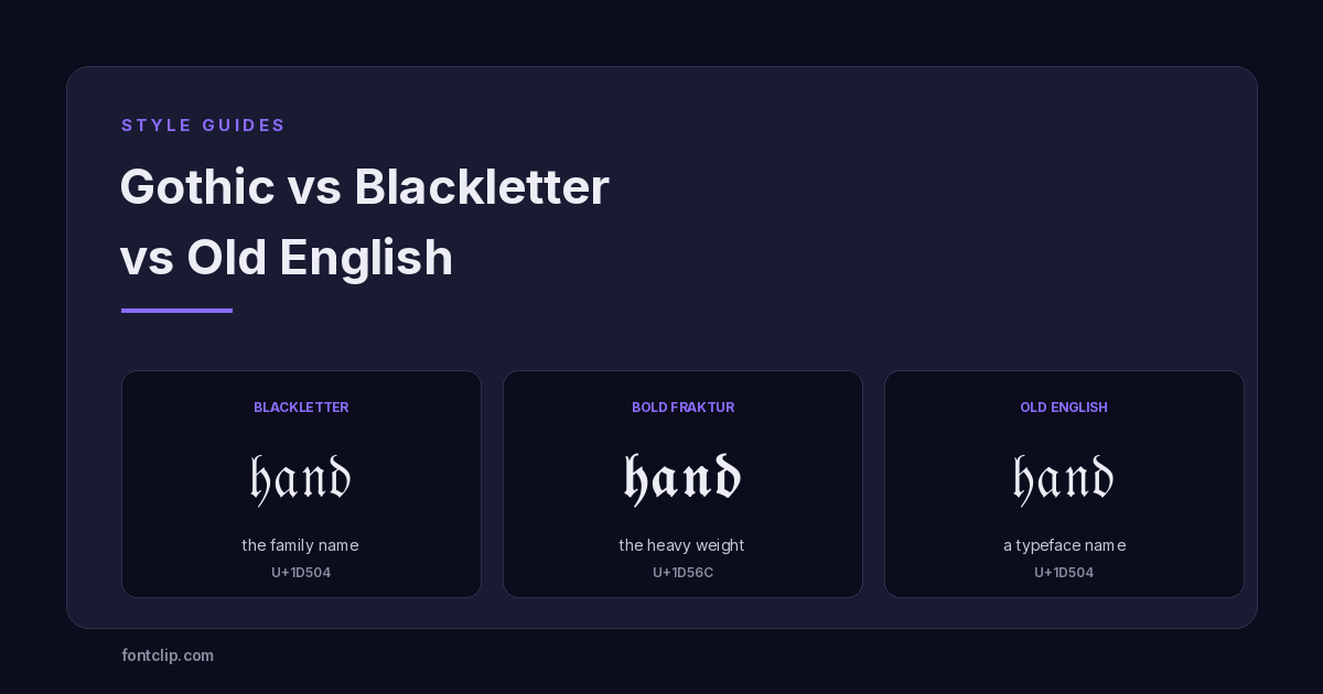
Three names, used interchangeably by almost everyone, for letterforms that are related but not the same thing. Tattoo artists say Old English. Metal bands say blackletter. Typographers say Fraktur and mean something specific. Search results treat all three as synonyms.
They are not synonyms, and the difference is not pedantry. One is a family, one is a member of that family, and one is a typeface name that also happens to be an unrelated language. Knowing which is which tells you what to ask for, and tells you why the version you paste online looks different from the one your tattoo artist drew.
The short answer
Blackletter is the family. Fraktur is one branch of that family. Old English is a typeface name from the twentieth century, based on a different branch, and it is also the name of a language spoken a thousand years ago that has nothing to do with any of it.
If you want the letterforms, ask for blackletter. If you want the specific broken-curve German look, ask for Fraktur. If you say Old English, you will probably get what you wanted, but you will also get search results about Beowulf.
Blackletter: the family, not a font
Blackletter is what scribes across Europe wrote from roughly 1150 onwards. The name is literal — the letters are dense and heavy, so a page of it looks black compared to the rounder scripts that came before.
It came about for a practical reason. Parchment was expensive. Narrow, tightly packed letters with strong vertical strokes fit more words on a sheet, and a broad-nib pen held at a steady angle produced them quickly. The look everyone now associates with medieval Europe was, at the time, a cost-saving measure.
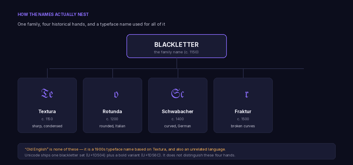
Over four centuries it split into regional hands. Four are worth naming, because they are what people are actually pointing at when they argue about which one is correct.
Textura
The sharpest and most condensed of the blackletter hands, and quite unlike the flowing shapes of cursive or calligraphy styles. Vertical strokes end in angled feet, curves are nearly eliminated, and the letters sit so close that a block of text reads as woven texture — which is where the name comes from. This is the hand of the Gutenberg Bible, and it is the one most modern Old English typefaces are based on.
Rotunda
The Italian and Spanish answer, rounder and noticeably more open. Southern European scribes never fully adopted the compressed northern style, so Rotunda keeps more of the curve from earlier scripts. It is the easiest of the four to actually read.
Schwabacher
A German hand from the 1400s, curvier than Textura but still heavy. It dominated early German printing before being displaced, and it is the least familiar of the four to English-speaking eyes.
Fraktur
Developed in Germany in the early 1500s, for printing commissioned by Emperor Maximilian I. Sources disagree on who cut the first type and on the exact year, so treat any single attribution you read with caution. The defining feature is in the name: fractus, broken. Curves that would be smooth in other hands are snapped into angled segments. Fraktur became the standard for German-language printing for roughly four hundred years, which is why German books printed before the mid-twentieth century look the way they do.
Old English: a typeface name, and a source of endless confusion
Here is the part that trips everyone up. Old English is not a historical script. It is the name of a typeface — most famously Old English Text MT, which ships with Microsoft Office and is where a large share of the world first met these letterforms.
The typeface is based on Textura, the sharpest of the medieval hands. So when someone says Old English, they usually mean Textura-style blackletter, filtered through a twentieth-century digital revival.
The confusion runs deeper than typography, because Old English is also the name of a language: the Anglo-Saxon English of roughly 450 to 1150 AD, the language of Beowulf. That language was written in insular script and later Carolingian minuscule. It was not written in blackletter, because blackletter did not exist yet. By the time blackletter appeared, Old English the language was already dead.
The one-line version
Old English the typeface has nothing to do with Old English the language. The typeface imitates a script from the 1400s. The language died out around 1150, before that script existed. Nobody ever wrote Beowulf in the font called Old English.
So where does "Gothic" fit in?
Gothic is the most overloaded word of the three, and it means at least four unrelated things depending on who is speaking.
- Gothic as a synonym for blackletter. Renaissance humanists in Italy thought the dense northern script was barbaric compared with the roman letters they were reviving, so they called it Gothic — after the Goths, and it was an insult. The name stuck.
- Gothic as a sans-serif category. In American type foundry usage, Gothic means a plain sans-serif. Franklin Gothic, News Gothic and Century Gothic contain no blackletter at all. This is the exact opposite of the first meaning.
- Gothic as a real historical language. Gothic was an East Germanic language with its own alphabet, devised in the fourth century. Unrelated to any of this.
- Gothic as an aesthetic. The subculture, the architecture, the fiction. This is what most people mean when they search for a gothic font today.
When someone asks for a gothic font online, they nearly always mean blackletter in the first sense. But a typographer hearing the same request might reasonably hand over Franklin Gothic, and both parties would be correct.
What Unicode actually gives you
All of that history collapses into something much simpler the moment you want to paste blackletter into a bio. Unicode does not care about Textura or Rotunda or Schwabacher. It ships two blackletter alphabets, and that is the whole supply.
- U+1D504 Mathematical Fraktur — the regular weight.
- U+1D56C Mathematical Bold Fraktur — the heavy weight.
Both live in the Mathematical Alphanumeric Symbols block, which exists so mathematicians can distinguish a Fraktur variable from an italic one in a formula. The fact that it doubles as an aesthetic tool for social media is an accident of history that Unicode never planned for.
This means the four historical hands are not available to you as separate options. Anyone advertising Textura, Rotunda and Schwabacher as distinct copy-paste styles is relabelling the same two alphabets.
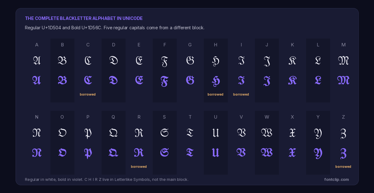
The five letters that break the pattern
Here is a detail worth knowing, because it explains a specific bug you may have run into.
In the regular U+1D504 alphabet, five capitals are missing: C, H, I, R and Z. Their codepoints sit empty in the block. Unicode left those slots unassigned because the letters had already been encoded years earlier in a different block, Letterlike Symbols, and the standard avoids encoding the same character twice.
So a complete regular blackletter alphabet has to reach into two separate blocks: twenty-one letters from U+1D504, and five from Letterlike Symbols at U+212D, U+210C, U+2111, U+211C and U+2128.
The practical consequence: on a device with patchy font coverage, those five letters can render while the other twenty-one show as boxes, or the reverse. If you have ever seen a blackletter word with a few letters inexplicably intact, this is why. The bold alphabet at U+1D56C has no such gaps — all twenty-six sit together, which makes bold the more reliable choice.
Want it to look right
Use bold blackletter. All 26 letters live in one block, so it renders consistently or not at all, rather than half-and-half.
Want maximum compatibility
Blackletter is one of the weaker blocks for support. Test it before committing it to a permanent username.
Want a specific hand
Unicode cannot do it. You need a real font file and image-based text, not copy-paste characters.
The tattoo and lettering question
A large share of people looking for these letterforms are not trying to paste anything. They want lettering for a tattoo, a jersey, a logo or a piece of graffiti, and the style they have in mind is usually one of two things.
The first is the sharp, high-contrast blackletter used on newspaper mastheads — The New York Times and countless local papers kept it long after everything else modernised, because it reads as authority and permanence.
The second is West Coast Chicano lettering, which grew out of Los Angeles in the mid-twentieth century. It borrows blackletter proportions but is a distinct tradition with its own conventions, developed by hand rather than adapted from European type. People search for it as "gangster" or "Chicano" Old English. If that is what you want, you are looking for a hand-lettering style, and no Unicode character set will give it to you — the flourishes and the specific letter constructions simply are not encoded.
Worth knowing before you commit it to skin: blackletter capitals are genuinely hard to read at a glance, and several pairs are easy to confuse — capital I and J, capital B and V, capital F and T. For a name or a date this is usually fine. For a long quote, ask your artist to letter the first word in blackletter and the rest in something readable, or accept that most people will not be able to read it.
Which term should you actually use?
An opinionated answer, since that is more useful than a list of options.
- Talking to a typographer, designer or calligrapher? Say blackletter. If you know which hand you want, name it — they will take you seriously and you will get the right thing.
- Looking for a font to download? Search blackletter first, then Old English. The two return substantially different results, and blackletter tends to surface better-made typefaces.
- Want to copy and paste it? The term barely matters, because there are only two alphabets. Ours is at the gothic font generator, listed alongside every other option under font styles, and the old english font generator is the same characters under the name most people search for.
- Getting a tattoo? Bring reference images, not a font name. Every artist interprets these letterforms differently, and the word you use will not communicate what you are picturing.
The short version
- Blackletter is the family of dense European scripts used from about 1150 onward.
- Textura, Rotunda, Schwabacher and Fraktur are four hands within that family. Fraktur is the broken-curve German one.
- Old English is a twentieth-century typeface name based on Textura. It is unrelated to the Old English language.
- Gothic means blackletter, or a sans-serif, or a dead language, or an aesthetic, depending entirely on context.
- Unicode ships exactly two blackletter alphabets: regular U+1D504 and bold U+1D56C. Bold is the more reliable of the two.
- Five regular capitals (C, H, I, R, Z) come from Letterlike Symbols, which is why blackletter sometimes renders only partially.
If a style renders as boxes on someone else's device, that is a font coverage problem rather than anything you did wrong — why fancy text shows as boxes explains what is happening and which blocks survive best.
Related Articles
 Unicode Explained
Why Your Fancy Text Shows as Boxes (and How to Fix It)
Empty boxes mean the reading device has no glyph for a character. How to tell tofu apart from U+FFFD and U+FFFC, and which Unicode blocks survive everywhere.
Read article →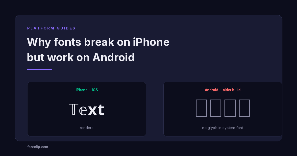 Platform Guides
Why Some Fonts Break on iPhone but Work on Android
The character is identical on both platforms. What differs is the font stack: iOS ships one, Android ships hundreds.
Read article →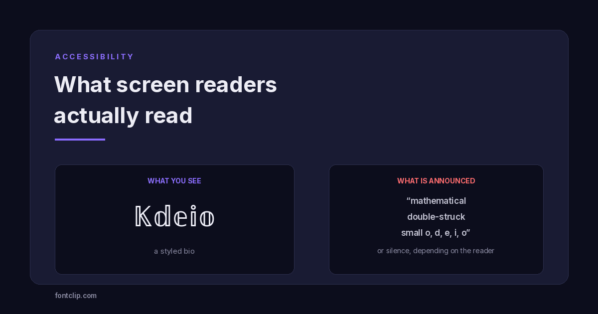 Accessibility
Are Fancy Fonts Accessible? What Screen Readers Actually Read
Styled text swaps letters for different Unicode characters. What screen readers announce, and where to draw the line.
Read article →Put It Into Practice
285 named, tested styles — with an honest note wherever one has limits.
Open the generator →