Why Your Fancy Text Shows as Boxes (and How to Fix It)
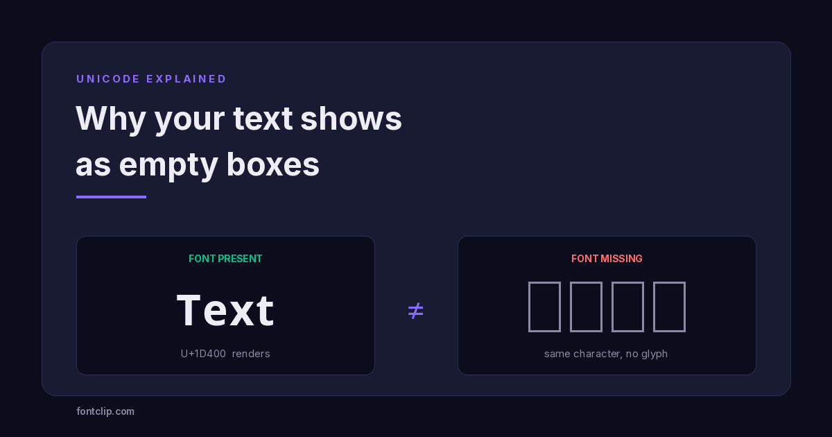
You copied a styled name into your Instagram bio. On your phone it looked perfect. Your friend opens the app and sees a row of empty rectangles. When fancy text shows as boxes like this, the instinct is to assume the text was corrupted somewhere along the way.
Nothing was corrupted, and you did not paste it wrong. The characters arrived on their phone exactly as they left yours. What failed is the last step of the chain — the moment a device tries to draw a character and discovers it has no picture for it.
That empty rectangle has a name. Typographers call it tofu, because it looks like a small white block. It is the single most common complaint about styled text, and almost every explanation of it online is wrong in the same way: they treat it as a font problem you can fix by picking a different font. It is not. Understanding what it actually is takes about four minutes, and it changes how you choose styles permanently.
Styled text is not a font — this is the whole explanation
When you use a generator on this site, you are not applying a font. There is no file being sent anywhere, and nothing installs on the reader's device.
What happens instead is substitution. Type Hello and the tool swaps each letter for a different character that already exists in Unicode and happens to look like a styled version of the original. The capital H becomes 𝐇, which is not an H with bold formatting applied — it is U+1D407 MATHEMATICAL BOLD CAPITAL H, a separate character with its own permanent identity in the Unicode standard.
This is why the text survives being pasted into a bio, a username, or a message. Those fields strip formatting, but they cannot strip characters. Bold formatting would be deleted. A bold character travels intact, because as far as the field is concerned it is just another letter.
The character is always transmitted correctly. What varies is whether the reader's device owns a font that knows how to draw it.
Unicode assigns the identity. Fonts supply the artwork. These are two entirely separate systems, and tofu is what you see when the first succeeds and the second fails. The full inventory is public: the Unicode Consortium publishes the Mathematical Alphanumeric Symbols chart listing every codepoint in the block.
Why a device would have no artwork for a character
Unicode currently defines well over 150,000 characters. No font on earth contains all of them, and no phone ships with a font that tries. Doing so would add hundreds of megabytes for glyphs that most people will never type.
Google's Noto font project exists specifically to close these gaps — the name is short for "no tofu". But no single font ships everywhere, so every operating system makes a judgement call about which ranges to include. Latin letters, digits and common punctuation are universal. Emoji became universal in the mid-2010s. The blocks that styled text depends on — the mathematical alphanumerics in particular — sit in a grey zone. They were added to Unicode for mathematicians who needed to distinguish a vector from a scalar in a formula. Nobody designing a phone's default font at the time anticipated that they would end up in TikTok bios.
When your text lands on a device, the system checks its installed fonts for a glyph matching that codepoint. If it finds one, you see the styled letter. If every font comes back empty, it draws the fallback rectangle. That rectangle is the system telling you, honestly, that it has no idea what this character looks like.
Which blocks survive, and which ones break
Not all styles fail equally, and the differences are consistent enough to plan around. The three blocks that matter for styled text are U+1D400 Mathematical Alphanumeric Symbols, U+FF00 Halfwidth and Fullwidth Forms, and U+0300 Combining Diacritical Marks. Each behaves differently in the wild.
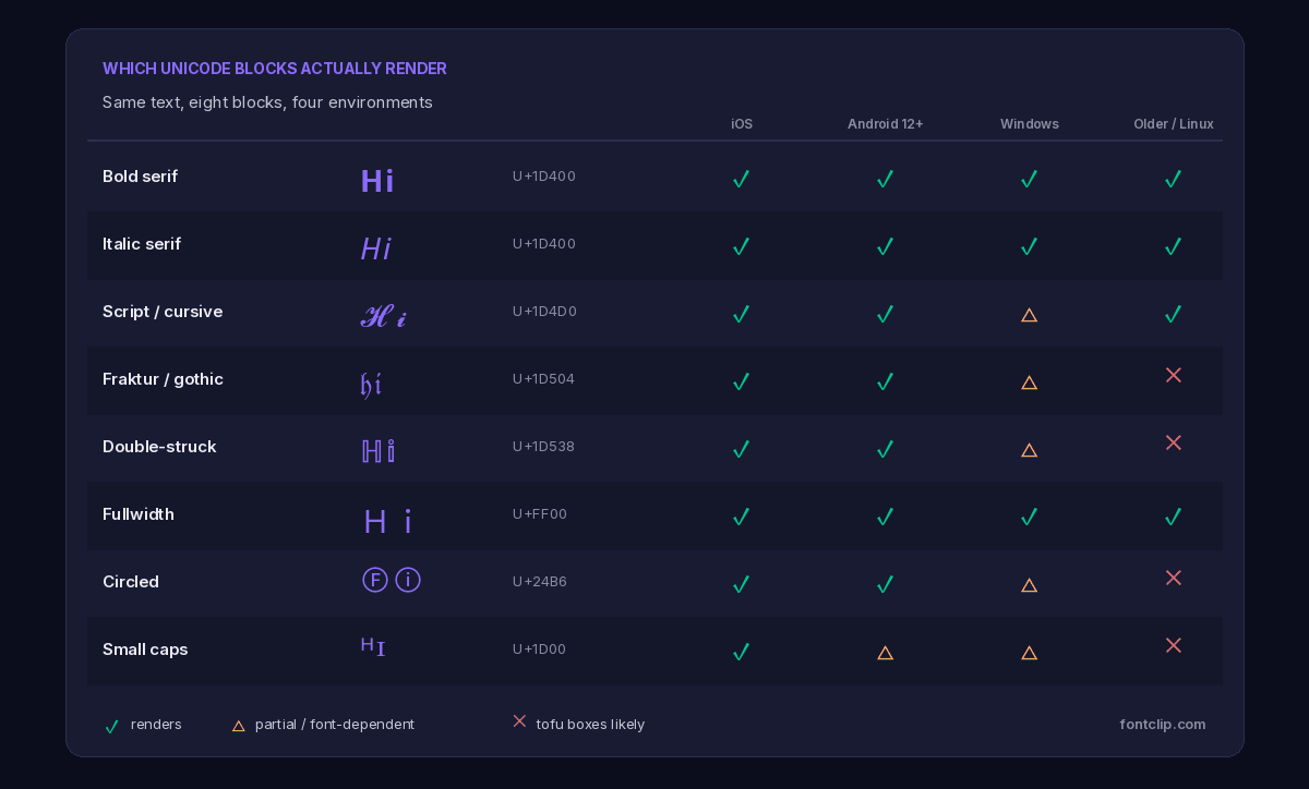
Bold and italic serif — the workhorses of the U+1D400 block — are as close to safe as styled text gets. They were among the earliest additions and have been in system fonts for well over a decade. Script and double-struck are common but not guaranteed. Fraktur, circled letters and small caps are where reports of boxes cluster, because they are drawn from ranges that many default fonts skip.
Fullwidth characters are an interesting exception. They look exotic to a Western eye, but they come from the CJK ranges required for Japanese, Chinese and Korean text. Because every major platform must support those languages, fullwidth support is excellent almost everywhere — often better than styles that look far more ordinary.
The rule that follows from this
Match the risk to the stakes. A username you will keep for three years should use bold, italic or fullwidth. A comment that scrolls away in an hour can use anything you like, because a handful of readers seeing boxes costs you nothing.
Not every box is tofu
Here is where most advice goes wrong. People see a rectangle, search for how to fix boxes, and apply a solution meant for a completely different problem. There are four box-shaped things you might be looking at, and only one of them is caused by a missing font.
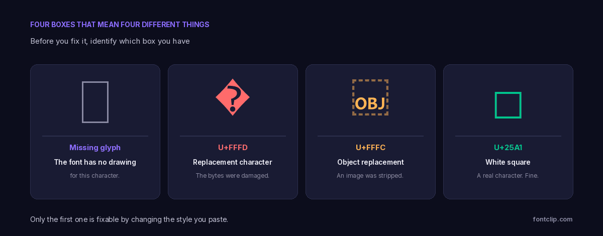
U+FFFD — the replacement character
If you see �, a dark diamond containing a question mark, the problem is not fonts at all. This is U+FFFD REPLACEMENT CHARACTER, and it means the underlying bytes were damaged — usually because text encoded in UTF-8 was read as if it were some other encoding.
The distinction matters because of what it implies. Tofu is a display problem: the data is intact, and copying it somewhere else may show it perfectly. U+FFFD is a data problem. The original information is already gone, and no font, device or style change will bring it back. If you see this in your own text, go back to the source and re-copy it.
U+FFFC — the object replacement character
 is U+FFFC OBJECT REPLACEMENT CHARACTER, and it appears when something that was not text got flattened into text. Copy a message containing an inline image, a sticker or an attachment, paste it into a plain text field, and the non-text object leaves this marker behind where it used to sit.
It shows up constantly when people paste from note-taking apps, messaging apps or email into a bio field. If you find one in text you are preparing, delete it — it carries no meaning and some platforms will render it as a stray box indefinitely.
U+25A1 — an actual square
□ is U+25A1 WHITE SQUARE, a normal geometric character that a font is drawing correctly. Nothing is broken. It is worth knowing about because it is visually almost identical to tofu, and people occasionally spend an afternoon debugging a character that was always supposed to be a square.
A quick way to tell them apart: try to select the character with your cursor and delete it. A real character deletes as one unit and can be re-typed. Tofu is not a character at all — it is a picture of absence, and the character underneath it is whatever you originally pasted.
How to work out what is happening in your case
Diagnosing this takes under a minute if you go in the right order.
- Check whether it fails for everyone or just one person. If it renders on your phone and breaks on a friend's, that is tofu and it is device-specific. If it breaks everywhere including where you created it, suspect U+FFFD and a broken copy.
- Check whether the boxes are uniform. Tofu produces identical rectangles because the system draws the same fallback for every missing glyph. Mixed shapes — some rectangles, some diamonds — mean you have more than one problem.
- Count them against your text. If you typed five letters and see five boxes, the characters are intact and only the drawing failed. If five letters produced eleven boxes, you likely have combining marks, where each visible letter is several characters stacked together.
- Paste it somewhere neutral. A note app on a different device is the fastest test. If it renders there, the character is fine and you are looking at a font gap on the original device.
If it breaks for your audience
Switch to bold or italic serif from U+1D400. These have the widest coverage of anything that still looks styled.
If it breaks only in one app
The app is substituting its own font. Some chat clients and Android keyboards do this. The character is fine; that app simply chose a font without the glyph.
If it breaks everywhere
You are almost certainly looking at U+FFFD from a bad copy, not tofu. Re-copy from the original source rather than changing style.
The trap that catches people who did everything right
There is one failure mode worth calling out separately, because it produces boxes even when the style you chose is well supported.
Styles built from U+0300 Combining Diacritical Marks — the glitchy, distorted, "cursed" looks — do not replace your letters. They keep the original letters and stack extra marks on top. A single visible character might be five or six actual characters layered together.
Two consequences follow. First, character limits count what is stored, not what is displayed, so a 150-character Instagram bio can fill up after 30 visible letters. Second, when a device cannot stack marks correctly, it does not fail gracefully — it renders each mark separately, and a short phrase turns into a long trail of boxes and floating accents.
This is why we flag combining-mark styles on the glitch font generator rather than presenting them as equivalent to the rest. They are genuinely fun for a chat message and genuinely unwise for a permanent username.
Why this cannot be fixed once and for all
An honest answer to the obvious question: no, there is no setting that makes styled text work everywhere, and there will not be one.
The rendering decision belongs entirely to the device doing the reading. A site that produces the text has no way to reach across and install a font on a stranger's phone, and no way to detect what their phone has. The only real control anyone has is which characters they choose to send — which is why knowing the block behind a style is more useful than knowing its name.
The situation does improve slowly. Each Android and iOS release tends to widen font coverage, so styles that failed years ago often render today. But there is a permanent long tail of older devices, budget hardware, embedded browsers and apps that ship their own fonts, and that tail never fully disappears.
The practical stance: treat wide support as a feature you deliberately choose when it matters, not as something you assume. Every style in our generator is tested and named, and where one has real limits, we say so on the page rather than letting you find out from a confused reply.
The short version
- Styled text is Unicode characters, not fonts. The characters always transmit correctly.
- Tofu means the reader's device has no glyph for a character. It is a drawing failure, not a data failure.
- � U+FFFD means damaged bytes and unrecoverable data.  U+FFFC means a stripped image. □ U+25A1 is a real square and is fine.
- Bold and italic from U+1D400 and fullwidth from U+FF00 have the widest support. Fraktur, circled and small caps fail most often.
- Combining-mark styles consume character limits several times over and degrade badly. Avoid them for permanent names.
If you want to see how a specific style behaves before committing to it, every generator on this site lists the Unicode block it draws from and flags the styles with known limits. Start with the bold text generator if you want something that will render essentially everywhere, browse every option under font styles, or read why the same character behaves differently on iPhone and Android for the platform-specific detail.
Related Articles
 Platform Guides
Why Some Fonts Break on iPhone but Work on Android
The character is identical on both platforms. What differs is the font stack: iOS ships one, Android ships hundreds.
Read article →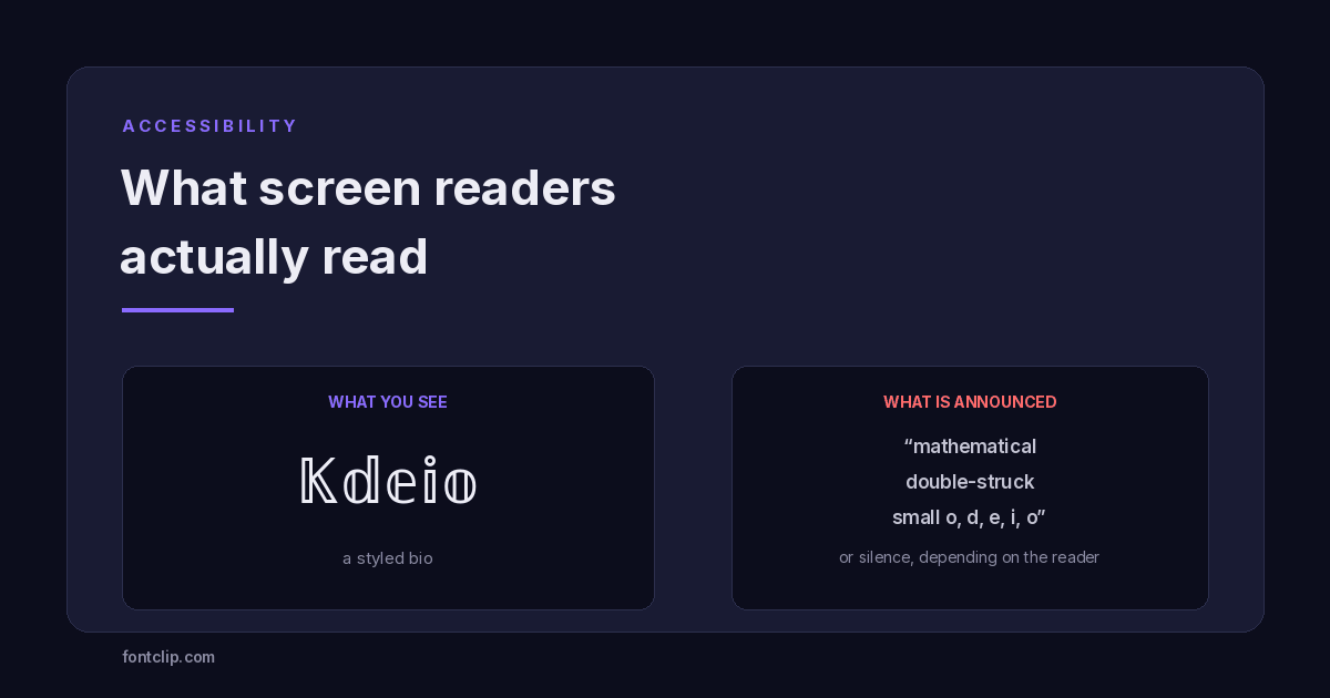 Accessibility
Are Fancy Fonts Accessible? What Screen Readers Actually Read
Styled text swaps letters for different Unicode characters. What screen readers announce, and where to draw the line.
Read article →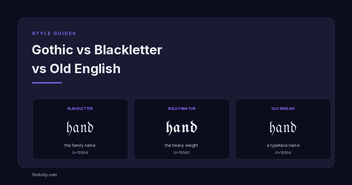 Style Guides
Gothic vs Blackletter vs Old English: A Typography Primer
Blackletter is the family, Fraktur is one branch, Old English is a typeface name. What each term means, and the two alphabets Unicode actually ships.
Read article →Put It Into Practice
285 named, tested styles — with an honest note wherever one has limits.
Open the generator →