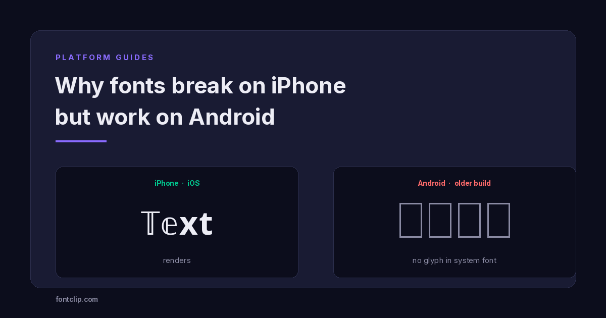
You set a styled username. It looks right on your phone. A friend on a different phone sees half of it as empty rectangles, and the other half fine. Nobody typed anything wrong.
The usual explanation is that iPhone supports more fonts than Android, or the reverse depending on who is arguing. Both are wrong, and the real answer is more useful because it tells you which styles to pick.
The character is identical on both platforms
This is the part worth being precise about. When you copy styled text, you are not copying a font. You are copying Unicode codepoints — numbers that identify specific characters.
A double-struck capital T is U+1D54B. That number is the same on an iPhone, a Samsung, a Pixel, a Windows laptop and a smart fridge. It does not change in transit, it is not converted, and the receiving device gets exactly what you sent.
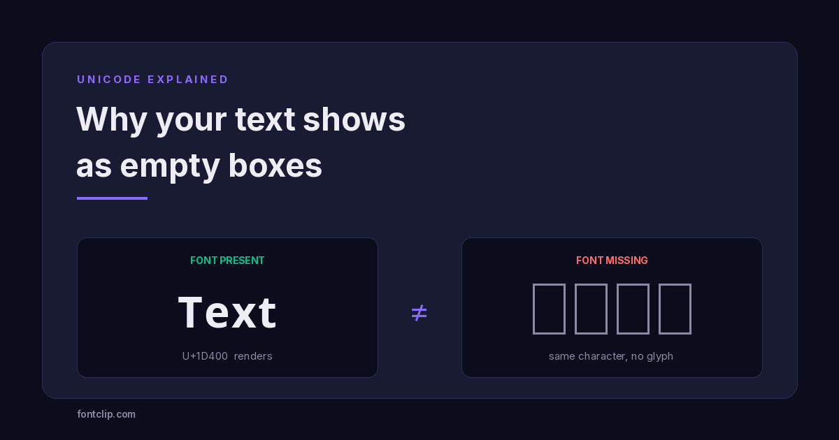
What differs is whether the device has a picture for that number. Unicode assigns identity; fonts supply artwork. A phone with no glyph for U+1D54B draws a fallback rectangle instead — the thing typographers call tofu.
Nothing breaks in transmission. The failure happens in the last hundred milliseconds, on the reader's device, when it looks for a glyph and finds nothing.
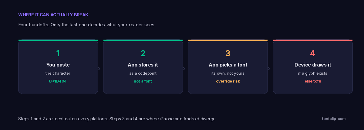
Why the two platforms differ at all
The difference comes down to how each platform decides what ships in its default fonts, and how much control the device maker has over that decision.
iOS is one company shipping one font stack
Apple controls the hardware, the operating system and the fonts. Every iPhone running a given iOS version has the same font coverage as every other iPhone running that version. When Apple adds glyph coverage, it reaches the entire fleet within months, because iOS adoption is fast and Apple supports old devices for a long time.
The practical effect: iPhone behaviour is predictable. If a style renders on one current iPhone, it renders on essentially all of them.
Android is many companies shipping many font stacks
Android is a base that manufacturers modify. Samsung, Xiaomi, Oppo, Motorola and dozens of others ship their own builds, with their own system fonts, on their own update schedules. A budget handset may run an OS version several years old and never receive another update.
Google's own Noto font project has genuinely broad coverage — the name is short for "no tofu", which tells you what problem it was built to solve. But a manufacturer is not obliged to ship all of it, and font files are large, so budget devices often ship a trimmed subset.
The practical effect: Android behaviour is a range, not a value. A current Pixel may render more than a current iPhone. A three-year-old budget device may render far less.
The correction worth making
It is not iPhone versus Android. It is "one predictable font stack" versus "hundreds of varying ones". Modern flagship Android phones often have better coverage than iPhones. The failures cluster on older and cheaper Android hardware, which is a large share of the world.
The third variable nobody mentions: the app
Even with identical hardware and OS, the same text can render differently in two apps on the same phone. This surprises people, and it is the most common reason someone reports that a style "broke on Android but works on Android".
Apps do not have to use the system font. Many ship their own, and a bundled app font is usually tuned for size — it covers the Latin alphabet, digits, punctuation and little else. When an app font lacks a glyph, the system may fall back to a system font, or it may not.
- Chat apps often bundle their own typeface for brand consistency, which is why our Discord and Instagram pages flag styles separately.
- Keyboard apps render their own preview text, which is why a style can look correct while typing and wrong after sending.
- In-app browsers can differ from the standalone browser on the same device.
- Games and custom UIs frequently use a texture atlas with a fixed character set, so anything outside it cannot render at all.
This is why the honest answer to "will this work on Instagram" is that it depends on the app version, the device and the OS together — and why we test styles rather than assuming.
Diagnosing a specific failure
If someone tells you your text looks broken, these four checks isolate the cause in about a minute.
- Ask whether all of it broke or only some letters. Partial failure means a style drawn from more than one Unicode block, where the device has one block and not the other. Blackletter does this often.
- Ask them to view it in a different app. If it renders in their notes app but not in the chat app, the app is substituting its own font. Nothing about the character is wrong.
- Ask what phone and roughly how old. A device more than four or five years old, or a budget model, is the single strongest predictor of missing coverage.
- Check whether it failed for you too. If it looks wrong everywhere including where you created it, you are probably looking at a damaged copy rather than a font gap.
For a permanent username
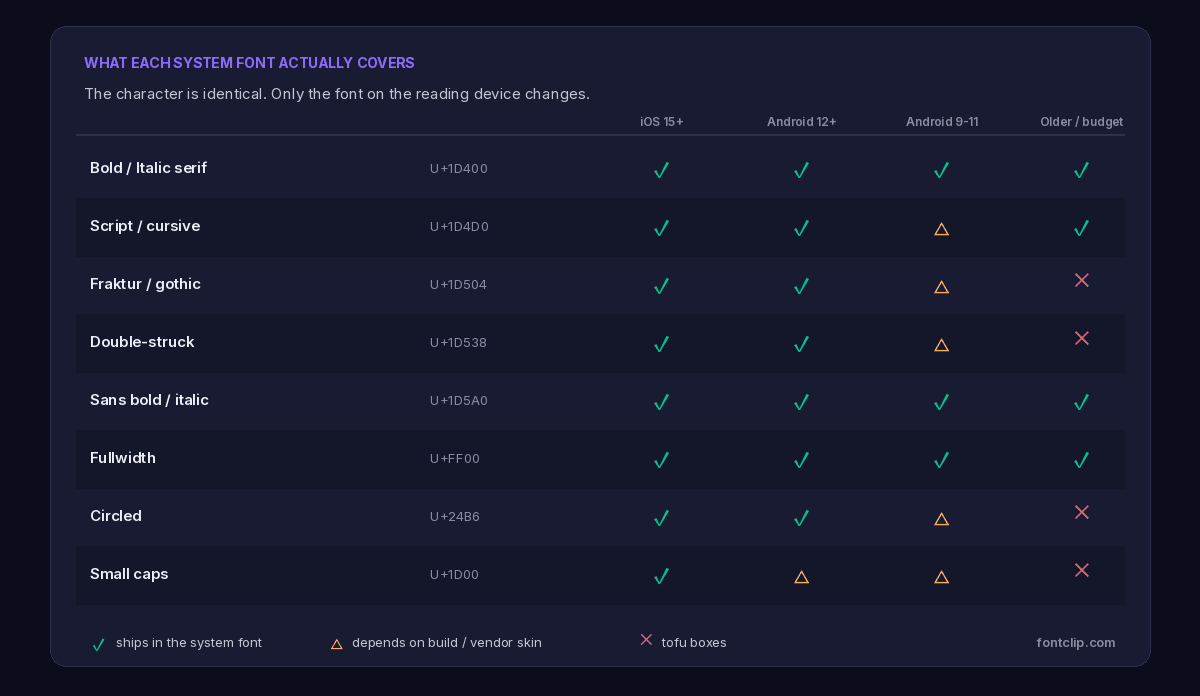
Bold or italic serif from U+1D400, or fullwidth from U+FF00. These are the most widely supported styles that still look styled.
For a disposable message
Anything you like. A few readers seeing boxes on a comment that scrolls away in an hour costs you nothing.
For a global audience
Assume a meaningful share are on older Android hardware. Test on a budget device if you can borrow one.
Why fullwidth is the quiet winner
One style deserves a specific mention because it behaves better than its appearance suggests.
Fullwidth characters (U+FF00 Halfwidth and Fullwidth Forms) look exotic to a Western eye — wide, airy letters with generous spacing. You might reasonably assume they are obscure and poorly supported.
The opposite is true. Fullwidth forms exist because Japanese, Chinese and Korean typesetting needs Latin letters that occupy the same square as a CJK character. Every platform that sells devices in East Asia — which is every platform — must support them properly. That is a market requirement, not a nice-to-have.
So fullwidth inherits the reliability of CJK support, which is close to universal. If you want something visually distinctive that will render on almost any device, it is the safest unusual choice available.
Why coverage varies by block, not by style name
A style name tells you what something looks like. The Unicode block tells you whether it will render. These are different questions, and only the second one predicts failure.
The mathematical alphabets at U+1D400 were added so mathematicians could write a bold vector and an italic scalar in the same equation without ambiguity. They arrived early, they matter to academic publishing, and font makers included them. That is why bold and italic serif are effectively universal today — not because they look plain, but because they have been in the standard long enough to reach everything.
Fraktur, double-struck and circled forms came from the same impulse but serve narrower audiences. Fewer font projects prioritised them, so they are the first casualties when a manufacturer trims a font file to save space.
There is a further wrinkle that produces the strangest-looking failures. Some styles are not stored in one contiguous block. Blackletter is the clearest case: twenty-one of its capitals live at U+1D504, but five — C, H, I, R and Z — were encoded years earlier in Letterlike Symbols and were therefore left unassigned in the newer block. A device can easily have one range and not the other.
The result is a word where most letters are boxes and a few are perfect, which looks like corruption but is simply two blocks with different support. If you have seen this and assumed something was broken, nothing was.
What actually changes over time
Coverage does improve, slowly and unevenly.
Each iOS and Android release tends to widen the default font, so styles that failed several years ago frequently render on current hardware. Google's Noto project exists specifically to close these gaps and is the most likely route by which a missing block eventually arrives on a device.
But there is a permanent tail. Phones do not update forever, budget hardware ships with trimmed fonts, embedded browsers lag behind, and apps that bundle their own typefaces are unaffected by any OS improvement. That tail never reaches zero, and in markets where older Android devices dominate it is not a small minority.
The reasonable stance is to treat broad support as something you choose deliberately when the stakes justify it, rather than something you assume by default.
What you cannot do about it
An honest limit: you cannot fix this from your end, and neither can we.
A website can load a webfont for text it displays on its own pages. But when you paste characters into someone else's app, that app decides the font. There is no mechanism for a character to carry its own artwork, no way to detect what a stranger's phone has installed, and no setting either of you can change.
The only real control is the choice of which characters to send. That is why every generator on this site names the Unicode block behind each style — the block predicts the risk far better than the style name does.
Worth knowing: a handle that renders as boxes for part of your audience is not a cosmetic issue. People cannot search for you, cannot type your name, and cannot tell anyone else what you are called. For anything discoverable, keep the searchable form plain and put the styling elsewhere.
The short version
- The character is identical on every platform. Only the glyph lookup differs.
- iOS has one predictable font stack. Android has hundreds, varying by manufacturer, model and age.
- Modern flagship Android often renders more than iPhone. Older and budget Android renders less.
- Apps can override the system font entirely, which is why the same text differs between two apps on one phone.
- Bold and italic (U+1D400) and fullwidth (U+FF00) are the most reliable. Fraktur, circled and small caps fail most often.
- Partial failure — some letters fine, some boxes — means the style spans two Unicode blocks.
For the full explanation of what tofu is and how to tell it apart from a damaged copy, see why fancy text shows as boxes, and gothic vs blackletter vs old english for why that style splits across two blocks. If you want something that renders essentially everywhere, start with the bold text generator.
Related Articles
 Unicode Explained
Why Your Fancy Text Shows as Boxes (and How to Fix It)
Empty boxes mean the reading device has no glyph for a character. How to tell tofu apart from U+FFFD and U+FFFC, and which Unicode blocks survive everywhere.
Read article →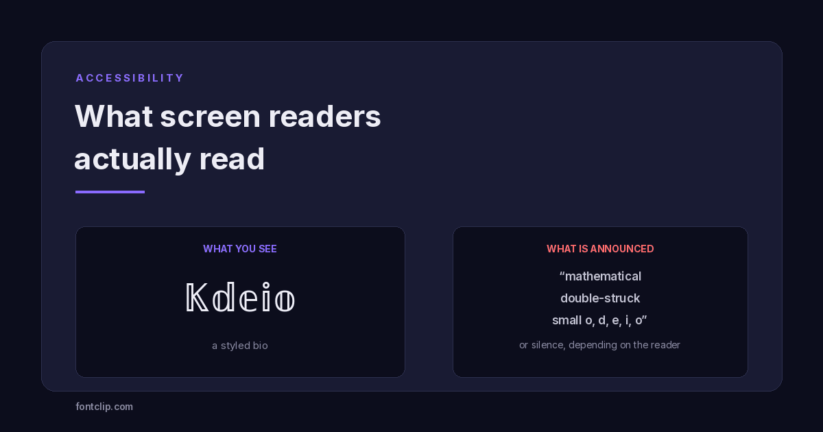 Accessibility
Are Fancy Fonts Accessible? What Screen Readers Actually Read
Styled text swaps letters for different Unicode characters. What screen readers announce, and where to draw the line.
Read article →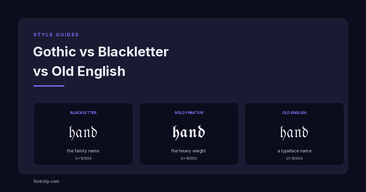 Style Guides
Gothic vs Blackletter vs Old English: A Typography Primer
Blackletter is the family, Fraktur is one branch, Old English is a typeface name. What each term means, and the two alphabets Unicode actually ships.
Read article →Put It Into Practice
285 named, tested styles — with an honest note wherever one has limits.
Open the generator →