Are Fancy Fonts Accessible? What Screen Readers Actually Read
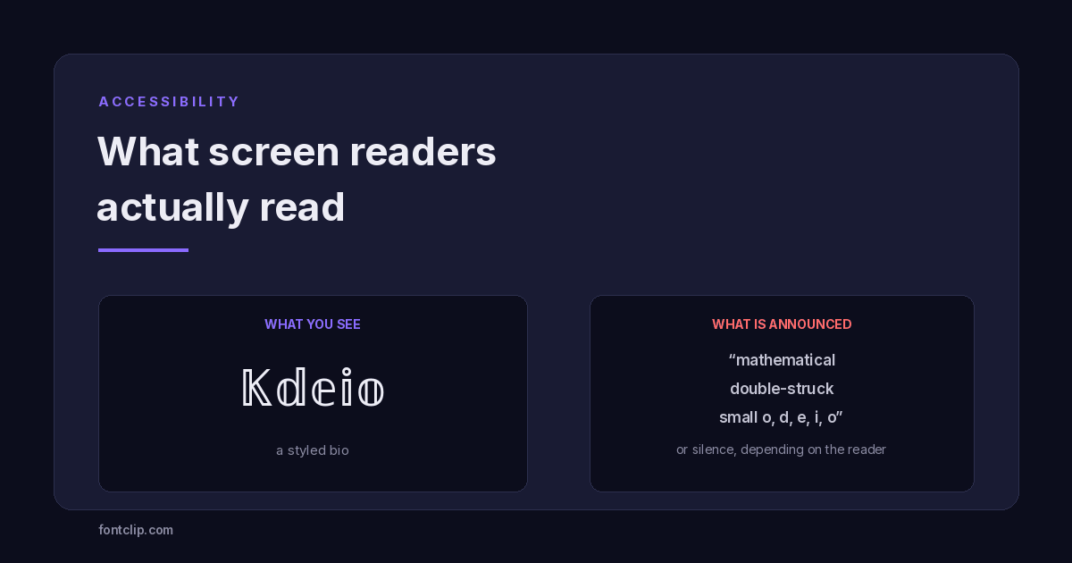
A styled bio looks distinctive. To a person using a screen reader, it may be announced as a string of Unicode character names, spelled out letter by letter, or skipped entirely.
So are fancy fonts accessible? The short answer is that a fancy font is accessible to the eye and largely inaccessible to everything else — and once you know why, you can keep the look without paying the full cost.
This is the least discussed thing about styled text, and it is the one with real consequences. Not because anyone is doing something wrong by using it, but because almost nobody is told what the trade-off is before they make it.
What follows is what actually happens, why it happens, and a pattern that keeps most of the visual effect without most of the cost.
Why assistive technology struggles with it
Screen readers work from the characters, not the shapes. When they encounter a letter, they look it up and announce the corresponding sound.
Ordinary e is U+0065 LATIN SMALL LETTER E. Every screen reader knows it, in every language it supports.
Styled 𝖞 is U+1D556 MATHEMATICAL DOUBLE-STRUCK SMALL E. It is a different character with a different identity, and it was added to Unicode for mathematical notation — where reading it aloud as "double-struck e" is exactly correct, because in an equation that distinction carries meaning.
The software is not malfunctioning. It is doing precisely what it should: reporting the character it was given. The mismatch is that you meant it as decoration and the standard defines it as mathematics.
Styled text is not a font applied to letters. It is a substitution of different characters that happen to look similar — and assistive technology reads the characters, not the resemblance.
What actually gets announced
There is no single answer, and that is itself the important finding. Behaviour varies by screen reader, by version, by browser, by verbosity setting and by the specific Unicode block involved.
Broadly, one of four things happens:
- The character name is read aloud. Your styled word becomes a recitation of Unicode terminology rather than a word.
- It is spelled letter by letter. The reader recognises the characters individually but cannot treat the sequence as a word, so it loses all natural pronunciation.
- It is skipped in silence. Arguably the worst outcome, because the listener has no indication that anything was there at all.
- It is read correctly. Some combinations of software do normalise styled characters back to plain letters. This is real, but it cannot be relied upon.
Accessibility practitioners testing Unicode symbol support across major screen readers, including discussions archived by the W3C Web Accessibility Initiative, have repeatedly found the same pattern: coverage is patchy and inconsistent enough that Unicode characters cannot be depended on to convey meaning. The details shift between versions, so any specific claim about what a given reader says today may be wrong next year. The general finding has been stable for a decade.
Why we will not publish a compatibility table for this
We publish tested tables for platform rendering because that behaviour is stable enough to be useful. Screen reader output is not — it changes with software versions and user settings, and a table would go stale without anyone noticing. The honest guidance is the pattern below, not a matrix.
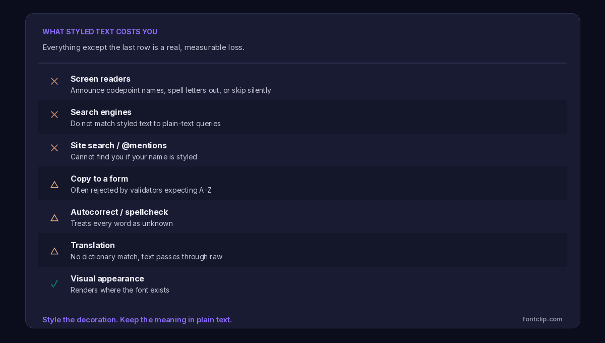
The costs that are not about disability at all
Accessibility is the strongest reason to be careful, but it is not the only one. The same property that confuses a screen reader — these are different characters, not styled letters — breaks several other things people care about immediately.
Search cannot find you
Someone typing your name into a search box types plain letters. A styled name is a different character sequence, so it does not match. This applies to search engines indexing a page, the search box inside a social platform, and site search on your own website.
If your display name is styled, people who know exactly what you are called still may not find you.
Mentions and tagging break
On platforms where users type an @ symbol followed by a name, styled characters are usually not typeable on a standard keyboard. Someone wanting to credit or tag you has to copy your name from somewhere — and many will simply not bother.
Forms reject it
Validators frequently restrict name fields to a defined character range. Styled characters fall outside it, producing an error that gives no indication of the real cause.
Translation passes it through untouched
Machine translation matches words against a dictionary. Styled text matches nothing, so it is typically emitted unchanged. A reader in another language gets your styled words in their original form with no translation at all.
Character limits fill faster than they look
Most styled characters occupy more storage than a plain letter, and combining-mark styles are dramatically worse — a single visible letter may be five or six characters stacked. A 150-character bio can run out after 30 visible letters. The field counts what is stored, not what you see.
Who this actually affects
It is easy to picture a narrow group of users and conclude the trade-off is small. The affected group is wider than most people assume, and it includes situations that have nothing to do with permanent disability.
- People using screen readers such as JAWS, NVDA or VoiceOver, whose relative usage WebAIM tracks in its screen reader survey, because of blindness or low vision — the group usually thought of first.
- People with dyslexia or cognitive differences who use text-to-speech to read alongside the text rather than instead of it.
- Anyone listening rather than looking — driving, cooking, walking, or resting their eyes. Text-to-speech is a mainstream convenience feature now, not an assistive niche.
- People with older or cheaper devices, where the styled characters may not render at all and there is no fallback to hear.
- Anyone using translation to read your content in another language.
- Automated systems — search indexes, moderation tools, accessibility checkers and anything else that processes text.
The last point has a practical edge worth noting. Because styled characters evade plain-text matching, they are sometimes used deliberately to slip past automated moderation. Platforms know this. Some now treat unusual character substitution as a signal in its own right, which means heavy styling can occasionally attract scrutiny you did not want.
Where the stakes rise
For a personal account, this is a preference and nobody should feel lectured about it. For anything institutional the calculation changes, because many organisations operate under accessibility obligations for their public-facing content.
The specifics vary considerably by country and by the type of organisation, so this is not a claim about what any particular law requires of you — if you are unsure whether your organisation has obligations, that is a question for someone qualified to answer it. But the practical guidance points the same direction regardless of jurisdiction: content that has to be readable by everyone should not depend on characters that some readers cannot process.
The pattern that keeps both
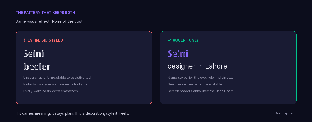
None of this means stop using styled text. It means put it where it is decoration and keep it away from where it carries meaning.
The test is a single question: if this were removed entirely, would anything essential be lost? If yes, it should be plain. If no, style it freely.
Style this
Decorative dividers, a single accent word, the visual flourish in a bio — anything that adds atmosphere rather than information.
Keep this plain
Your name, your handle, contact details, links, calls to action, anything you want found by search, and anything a person may need to type.
Never style this
Instructions, warnings, prices, dates, addresses — anything where a listener missing it entirely would be a genuine problem.
Which styles are least disruptive
If you are going to use styled text where it may be read by assistive technology, some blocks degrade more gracefully than others.
- Fullwidth (U+FF00) tends to be handled best. These characters exist for CJK typesetting rather than mathematics, and software is more likely to map them back to plain Latin letters.
- Bold and italic serif (U+1D400) are the most common styled characters in the wild, so they are the most likely to be handled deliberately by any software that handles styling at all.
- Combining-mark styles (U+0300) are the worst by a wide margin. They multiply character counts, break cursor movement and text selection, and can produce long unintelligible output. Avoid them anywhere accessibility matters.
If you are styling text for a business, an event or a public account: treat plain text as the default and styling as an exception you justify. A name nobody can search for, type, or hear read aloud is a real cost, and it is paid by the people least able to work around it.
A note on why this is not the tool's fault
It would be convenient to blame screen readers, or Unicode, or the platforms. None of them are behaving incorrectly.
Unicode encoded these characters for mathematical notation, where the distinction between a bold vector and an italic scalar is meaningful and must survive being copied between documents. Screen readers announce the characters they receive, which is exactly their job. Platforms strip formatting from bio fields for good security and consistency reasons, which is why people reached for character substitution in the first place.
What we have is a workaround being used at enormous scale for a purpose it was never designed to serve. It works visually and fails everywhere else, and no single party can fix that — which is precisely why the choice of where to use it matters.
The short version
- Styled text substitutes different characters. Assistive technology reads characters, not resemblance.
- Output varies: the character name, letter-by-letter spelling, silence, or occasionally correct reading. It cannot be relied on.
- Search, mentions, form validation, spellcheck and translation all break for the same underlying reason.
- Character limits count stored characters, so styled bios fill faster than they look. Combining marks are far worse.
- The rule: if removing it would lose something essential, keep it plain. Otherwise style it freely.
- Fullwidth degrades most gracefully. Combining-mark styles degrade worst.
For the technical background on why these are separate characters rather than formatting, see why fancy text shows as boxes. For how the same characters behave across devices, see why some fonts break on iPhone but work on Android.
Related Articles
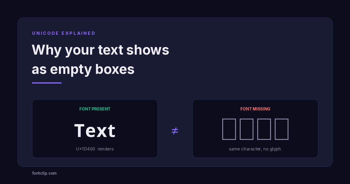 Unicode Explained
Why Your Fancy Text Shows as Boxes (and How to Fix It)
Empty boxes mean the reading device has no glyph for a character. How to tell tofu apart from U+FFFD and U+FFFC, and which Unicode blocks survive everywhere.
Read article →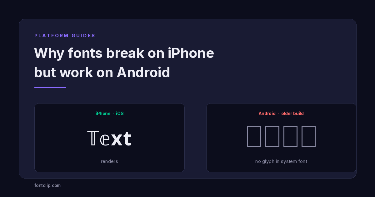 Platform Guides
Why Some Fonts Break on iPhone but Work on Android
The character is identical on both platforms. What differs is the font stack: iOS ships one, Android ships hundreds.
Read article →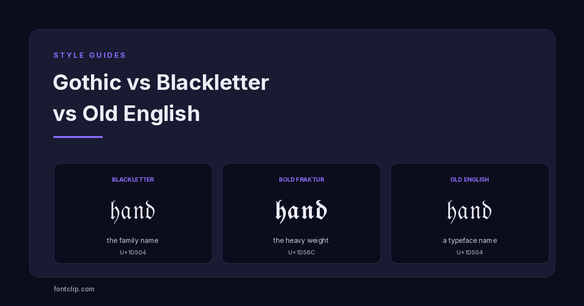 Style Guides
Gothic vs Blackletter vs Old English: A Typography Primer
Blackletter is the family, Fraktur is one branch, Old English is a typeface name. What each term means, and the two alphabets Unicode actually ships.
Read article →Put It Into Practice
285 named, tested styles — with an honest note wherever one has limits.
Open the generator →