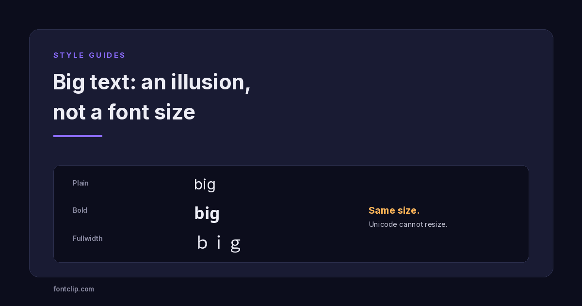
There is a specific disappointment that comes with "big text" generators. You paste the result into your bio expecting large letters, and what you get is text that is exactly the same height as everything around it — just heavier or wider.
This is not a broken generator. It is the fundamental limit of what Unicode can do, and understanding it explains why a big text generator or large text generator works in some places and not others, and which styles create the strongest illusion of size.
Unicode cannot change font size
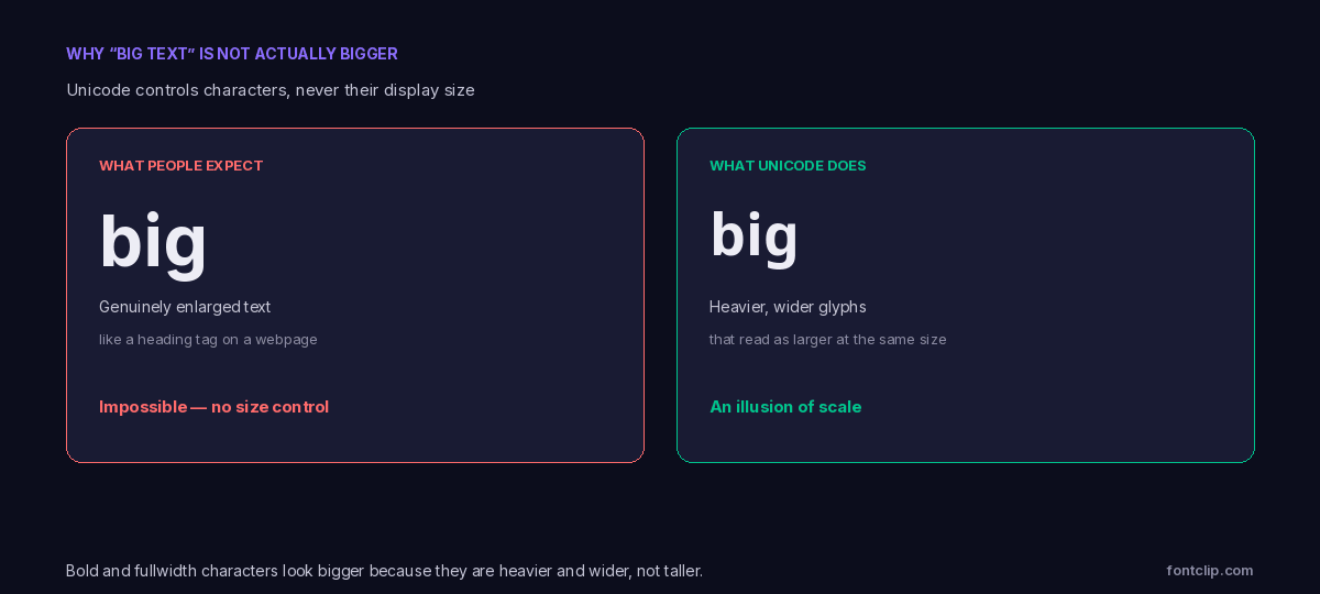
This is the core fact, and it is worth stating plainly: Unicode encodes which character a piece of text is, not how big it appears. Size is decided entirely by the app displaying the text — the font, the CSS, the interface.
When a webpage shows a large heading, that is the site's stylesheet setting a font size. You cannot embed that instruction in a character you paste into someone else's app, because there is no Unicode character that means "display me larger". The receiving app controls size, and it applies its own.
So genuinely enlarged text — the kind you would get from a heading tag — is impossible to achieve by pasting characters. Every "big text generator" is working around this limit rather than solving it.
How the illusion is created
What these generators actually do is exploit the fact that some characters look bigger than others at the same point size.
A bold character has thicker strokes, so it occupies more visual weight in the same vertical space. A fullwidth character is drawn on a wider grid, so it takes more horizontal room. Neither is taller, but both read as "bigger" because they are more prominent. The heavy styles come from the Mathematical Alphanumeric Symbols block; the wide ones from the fullwidth forms.
The effect is real to the eye even though the measured size is identical. It is the typographic equivalent of a bold headline in a newspaper set in the same point size as the body — it dominates because of weight, not height.
Which styles read biggest
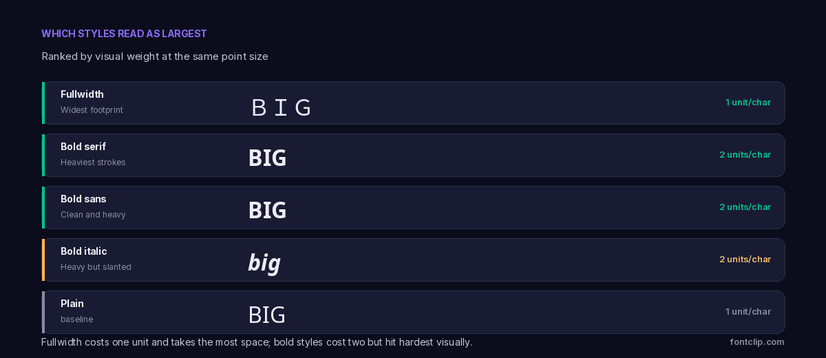
Fullwidth takes the most horizontal space. Its characters are drawn on the full-width CJK grid, so a fullwidth word occupies roughly twice the horizontal room of a plain one. On a single line it reads as the most dramatic, though it wraps quickly. It is covered in detail in the fullwidth guide.
Bold serif has the heaviest strokes, so it carries the most visual weight per character. If you want density rather than width, this reads largest.
Bold sans is nearly as heavy and cleaner, which usually looks better in a modern bio.
The honest summary: there is no way to make text taller, so "big" comes down to width (fullwidth) or weight (bold). Pick based on which dimension you want.
The other kind of "big text"
There is a completely separate thing also called a big text generator, and it is worth distinguishing because the search results mix them together.
Some tools produce ASCII art — large letters built out of many small characters arranged in the shape of a letter. An "A" made of dozens of hashes or block characters, spanning several lines.
 ____ ___ ____
| __ )_ _/ ___|
|  _ \| | |  _
| |_) | | |_| |
|____/___\____|
This is genuinely large — it spans multiple lines — but it is not text in any useful sense. It cannot go in a bio, it breaks on any narrow screen, it is unreadable to a screen reader, and it collapses the moment line spacing differs. It works in fixed-width contexts like code comments, terminal output, or a Discord code block, and nowhere else.
If a "big text generator" gives you something spanning multiple lines, it is ASCII art. If it gives you a single line of heavier characters, it is Unicode. They serve entirely different purposes.
Where the Unicode version works
Because "big" Unicode text is just bold or fullwidth characters, it works exactly where those work — which is almost everywhere text is displayed.
- Bios and display names across Instagram, TikTok, Discord and X. A bold first line reads as a heading even though it is the same size.
- Post and message text, where a heavy opening line creates hierarchy.
- Anywhere you cannot set real formatting but want one element to stand out.
It fails in the same places all styled text fails: usernames that reject non-standard characters, and anywhere the text needs to be searched or read aloud.
Is a large text generator ever the right tool?
Given all the caveats, it is fair to ask when reaching for a large text generator actually makes sense rather than just plain text.
The honest answer is: only when the platform gives you no other way to create emphasis, and only for a very small amount of text. A bold first line in an Instagram or TikTok bio earns its place because those fields have no formatting and no headings — the illusion of size is the only hierarchy available. A bold section header in a LinkedIn post does the same job for the same reason.
It is the wrong tool the moment real formatting exists. In a document, an email, a webpage or any editor with a size control, use the actual size control — it is genuinely larger, fully accessible and searchable. Pasting Unicode "big text" into a Google Doc instead of using its heading styles is the same mistake as pasting Unicode strikethrough where native strikethrough exists.
The test is simple: if the app can make text genuinely bigger, let it. If it cannot, the Unicode illusion is the best available option for one short line.
Telling the two kinds apart before you paste
Because "big text generator" returns both Unicode tools and ASCII-art tools, it helps to know which you are looking at before you commit.
If the output is a single line you can select as one string, it is Unicode — bold or fullwidth characters. It will paste into a bio and stay on one line. If the output spans several stacked lines and is built from small repeated symbols, it is ASCII art and will only survive in a fixed-width context. A quick way to check: try selecting the result. Unicode selects as continuous text; ASCII art selects as a block of many separate characters.
"Big text" is not exempt from the trade-offs that come with every styled style.
Bold characters sit above U+FFFF and cost two storage units each, so a bold line uses twice the character budget. Fullwidth costs one unit but takes double the visual width, so it runs out of visible space instead. Either way, a "big" line is more expensive than it looks.
And because these are substituted characters, they are not searchable and are announced awkwardly by screen readers — the same costs covered in the accessibility guide. A bold heading that a recruiter or follower cannot find in search has traded discoverability for a visual effect.
Two mistakes people make with big text
Two errors come up repeatedly and both are avoidable.
The first is styling an entire bio or post in bold to make it "stand out". Everything bold reads the same as everything plain — the eye only registers contrast, so a fully bold bio has no hierarchy at all, just uniform heaviness that is harder to read and costs double the characters. Bold works precisely because most of the text around it is not bold.
The second is using it where genuine size exists. If you are writing a document heading, an email subject, or anything with a real size control, the Unicode illusion is strictly worse than the real thing — smaller in effect, unsearchable, and inaccessible. The illusion is only worth it in fields that have no size control at all.
Both mistakes come from treating "big text" as a way to add importance. It is really a way to add contrast, and contrast only works when applied to a small part of the whole.
Using it well
For a heading effect
Bold sans on one line, plain text beneath. This is the pattern that reads as a genuine heading without costing your whole character budget.
For maximum drama
Fullwidth, but only for a very short phrase. It wraps fast and becomes hard to read past a few words.
For a real banner
If you genuinely need large multi-line letters in a code block or terminal, that is ASCII art — a different tool and not something to paste into a profile.
Why Unicode works this way
It is reasonable to ask why Unicode does not simply include a "large" version of the alphabet, given it includes bold, italic and dozens of other variants.
The answer is that bold and italic are treated as distinct characters with distinct meaning — a bold vector in mathematics is genuinely different from an italic scalar, so those needed encoding. The Unicode consortium's own guidance is consistent on this point: the standard encodes characters, not glyphs or presentation. Size is not like that. A large "A" and a small "A" are the same character; the difference is purely presentational, and presentation is the job of the display layer, not the character set.
Encoding a "large A" would break the principle that Unicode represents meaning rather than appearance. So the size illusion is the closest anyone can get, and it will stay that way.
The short version
- Unicode cannot change font size. It encodes which character appears, never how large it displays.
- "Big text" generators create an illusion using heavier (bold) or wider (fullwidth) characters at the same height.
- Fullwidth reads largest by width; bold serif reads largest by weight. Nothing makes text taller.
- A separate kind of "big text" is ASCII art — multi-line letters that only work in fixed-width contexts like code blocks.
- The Unicode version works in bios, names and posts, and fails in usernames, search and screen readers.
- Bold costs two units per character; fullwidth costs one but doubles the visual width.
The bold and fullwidth styles that read as "big" are on the font styles hub. For why these characters cost what they do against a limit, see character limits on every platform.
Related Articles
 Style Guides
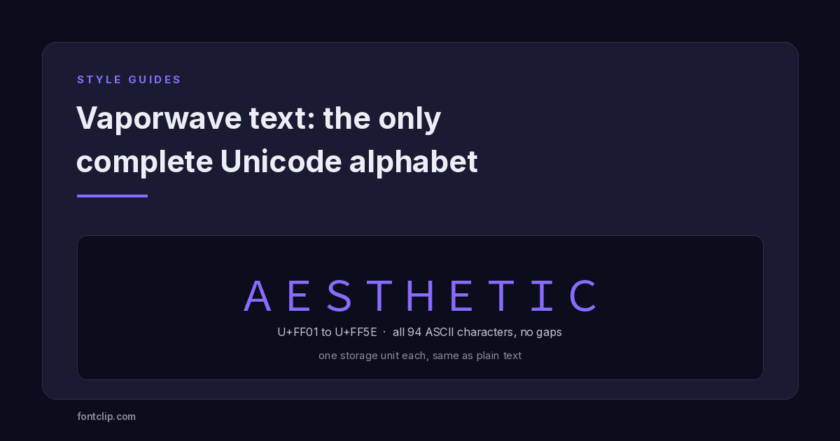
Vaporwave Text: The Only Complete Unicode Alphabet
Fullwidth is the only styled block with no missing characters, and it costs the same as plain text. Why, and where to use it.
Read article →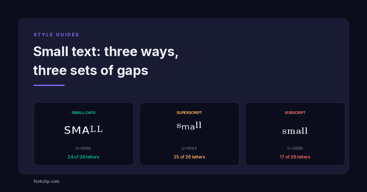 Style Guides
Small Text: Small Caps vs Superscript vs Subscript
Three Unicode small-text styles, and the letters each one is missing. Small caps has no Q or X. Subscript is missing nine.
Read article →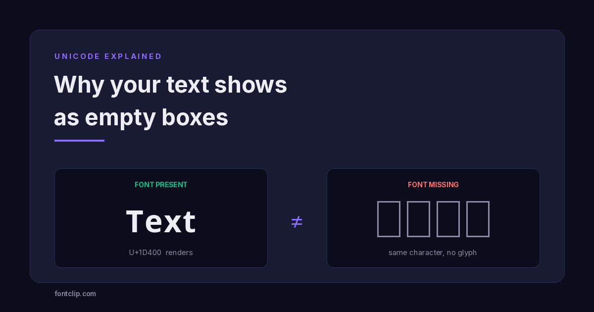 Unicode Explained
Why Your Fancy Text Shows as Boxes (and How to Fix It)
Empty boxes mean the reading device has no glyph for a character. How to tell tofu apart from U+FFFD and U+FFFC, and which Unicode blocks survive everywhere.
Read article →Put It Into Practice
285 named, tested styles — with an honest note wherever one has limits.
Open the generator →