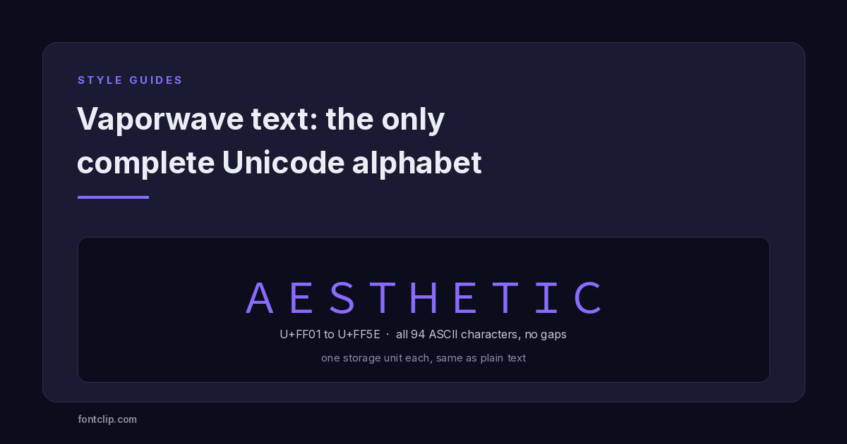
Most styled text is a compromise. You pick a look, then discover it is missing letters, or it costs double against a character limit, or it renders as boxes on half the devices that see it.
Vaporwave text — the wide, airy fullwidth style — is the one exception. It is the only styled alphabet in Unicode with no missing characters at all, it costs the same as plain text, and it renders almost everywhere.
That combination is unique, and the reason for it has nothing to do with aesthetics.
What fullwidth text actually is
The style comes from U+FF01 Halfwidth and Fullwidth Forms, a Unicode block that maps every printable ASCII character to a wide equivalent. A becomes A, 7 becomes 7, ? becomes ?.
The block exists for typesetting reasons, not decorative ones. Japanese, Chinese and Korean text is set on a square grid where each character occupies the same width. When Latin letters appear inside that text — a brand name, an abbreviation, a number — they need to match the grid, otherwise the line breaks visually.
So Unicode encoded a full-width version of every ASCII character. Not a selection. Every one.
The completeness nobody else has
This is the property worth understanding, because it is the one thing fullwidth has that no other styled block does.
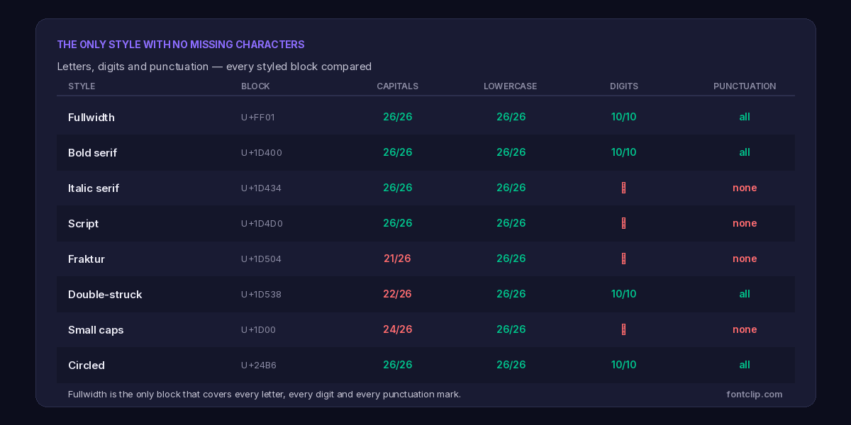
Look at what the other blocks lack. Fraktur is missing five capitals, which is why blackletter words sometimes render half-broken. Small caps has no Q or X. Italic serif and script cover letters but have no digits at all — you cannot write a styled year in script, which is why generators quietly substitute plain numbers.
Punctuation is worse. Most styled blocks encode letters and nothing else. No styled comma, no styled question mark, no styled apostrophe. A script sentence is really styled letters with plain punctuation wedged between them, and at large sizes the mismatch is visible.
Fullwidth has all of it. All 26 capitals, all 26 lowercase, all 10 digits, and all 32 punctuation marks and symbols in the printable ASCII range. Ninety-four characters, one-to-one, no gaps and no substitutions.
If you write a sentence in fullwidth, every character in it — including the full stop — is genuinely styled. That is not true of any other block.
Why the gaps exist elsewhere
The mathematical alphabets at U+1D400 were encoded for equations. Mathematicians need a bold vector and an italic scalar, so those got encoded. They do not write equations in styled punctuation, so styled punctuation was never added. The sets are complete for their purpose and incomplete for ours.
Fullwidth is complete because its purpose demanded completeness. A typesetting system that handles most ASCII characters but not the question mark would be useless.
It costs nothing extra
The second advantage is invisible until you run into a character limit.
Platforms count UTF-16 code units rather than visible letters. Characters below U+FFFF cost one unit; characters above it cost two. The mathematical alphabets — bold, italic, script, fraktur — all sit above U+FFFF, so every letter costs double.
Fullwidth sits at U+FF01, comfortably below the boundary. Each character costs one unit, exactly like plain text.
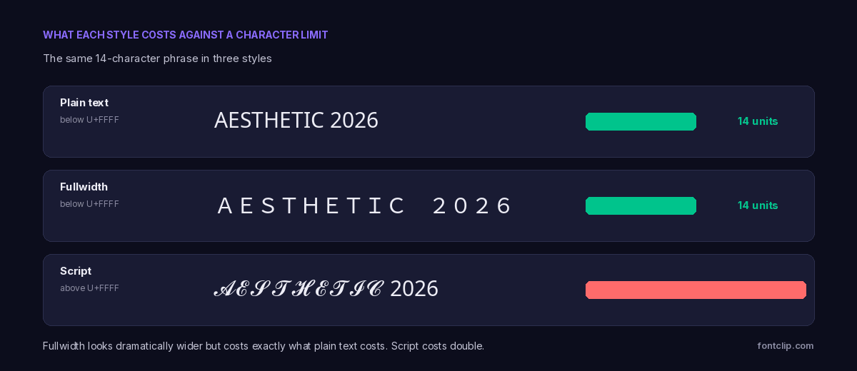
The practical effect on a tight field is substantial. In an 80-character TikTok bio you get roughly 80 fullwidth characters or roughly 40 script ones. In a 150-character Instagram bio, 150 against 75.
There is a catch, and it is a visual one rather than a technical one. Fullwidth characters are wide, so text set in them occupies far more horizontal space. You will usually run out of visible room in a bio before you run out of character budget. But you will not be truncated mid-character, which is the failure mode that produces broken symbols — character limits on every platform covers that in detail.
Support is unusually good
The third advantage, and the one people find most surprising: fullwidth renders more reliably than styles that look far more ordinary.
The reason is market forces. Fullwidth forms are required for Japanese, Chinese and Korean typesetting. Every platform that sells devices in East Asia must support them properly, and every platform sells devices in East Asia. Support is not a nice-to-have that a font vendor might skip — it is a requirement.
Compare that with fraktur or double-struck, which serve a small academic audience and are the first things trimmed when a budget device ships a reduced font file. Fullwidth inherits the reliability of CJK support, which is close to universal. If you want something visually distinctive that will render on almost any device that reaches your audience, this is the safest unusual choice available.
Why a vaporwave text generator produces this style
Search for a vaporwave text generator and you will get fullwidth characters, because the style is inseparable from vaporwave — a music and visual genre that emerged online around 2010 and drew heavily on 1980s and 1990s Japanese commercial design — city pop record sleeves, early Macintosh interfaces, shopping mall signage, Windows 95 dialogue boxes.
Fullwidth text was a natural fit, and not only because it looks retro. Artists were sampling Japanese media directly, and Japanese text uses these characters as a matter of course. Album titles set in fullwidth were partly an aesthetic choice and partly a direct borrowing from the source material.
The stretched, unhurried spacing also matched the genre's musical character — slowed-down samples, extended reverb. The typography and the sound were doing the same thing.
What is worth noticing is that a typesetting mechanism from CJK publishing became an aesthetic signature entirely by accident. Nobody encoding U+FF01 in the early 1990s was thinking about album art.
Using it well
Fullwidth has one significant weakness, and it follows directly from its strength.
The characters are wide. A short phrase reads as deliberate and striking; a full sentence becomes tiring to read and will wrap awkwardly on a phone. This is a display style, not a body-text style.
Good uses
A name, a short tagline, a section divider in a bio, a username. Anything under about five words where the spacing reads as intentional.
Poor uses
Full sentences, paragraphs, anything a reader needs to move through quickly. The wide spacing slows reading noticeably.
The reliable pattern
One fullwidth line paired with one plain line. The contrast does the work, and the plain line stays searchable.
The space character matters
A detail most generators get wrong. Fullwidth text should use the ideographic space at U+3000 rather than an ordinary space. A normal space between fullwidth characters is visually too narrow and breaks the grid effect that makes the style work.
If your fullwidth text looks subtly wrong — wide letters but cramped gaps — this is almost always why.
Halfwidth: the same idea in reverse
The block is called Halfwidth and Fullwidth Forms, and the other half is worth a brief mention because it occasionally surfaces.
Halfwidth forms solve the opposite problem. Japanese katakana normally occupies a full square, but in constrained displays — early terminals, receipt printers, some game interfaces — a narrower version was needed. Unicode encoded halfwidth katakana for the same compatibility reasons it encoded fullwidth Latin.
You will occasionally see halfwidth katakana used decoratively in usernames, producing a cramped, glitchy look that reads as deliberately lo-fi. It is far less common than fullwidth and considerably less readable to anyone who actually reads Japanese, since it looks like text squeezed onto an old receipt.
Both halves of the block exist for the same underlying reason: real typesetting systems needed characters at a width the default did not provide. Neither was designed to look interesting.
Where it works, platform by platform
Because support comes from CJK requirements rather than styling features, fullwidth behaves consistently across platforms in a way most styles do not.
- Instagram — works in the bio and display name. Rejected in the username, which permits only letters, numbers, periods and underscores.
- TikTok — works in the bio and nickname. The one-unit cost is a real advantage against the 80-character limit.
- Discord — works in display names, server names, channel names and messages. Not in the username, which is lowercase-restricted.
- X — works in the bio and display name.
- YouTube and Spotify — work in channel and playlist names, which is why so many vaporwave playlists use it.
The pattern is the usual one: it works wherever text is displayed and fails wherever text is validated. Our Instagram and Discord pages flag the specific fields for each.
The costs that still apply
Fullwidth avoids the two problems that plague other styles. It does not avoid the third.
These are still substituted characters rather than formatted letters. A screen reader may announce them oddly or spell them out. Search will not match fullwidth text against a plain-text query — someone searching for your name in normal letters will not find a fullwidth version of it. Someone wanting to type your handle cannot produce these characters from a standard keyboard.
Fullwidth is better than script or fraktur on rendering and character cost. On accessibility and searchability it carries exactly the same cost as every other styled block, and the accessibility guide applies to it unchanged.
The rule that follows: style the decoration, keep the meaning plain. A fullwidth accent line above a plain-text bio gives you the aesthetic without making your account unsearchable. A fully fullwidth bio looks striking and costs you discoverability.
The short version
- Fullwidth text comes from U+FF01, a block built for mixing Latin characters into CJK typesetting.
- It is the only styled block with no gaps: all 26 capitals, 26 lowercase, 10 digits and 32 punctuation marks.
- It sits below U+FFFF, so it costs one unit per character — the same as plain text, half what script or fraktur cost.
- Support is near-universal because East Asian language support requires it.
- Use U+3000 for spaces, not an ordinary space, or the grid effect breaks.
- It is a display style. Short phrases work; sentences become hard to read.
- Accessibility and search costs still apply, exactly as with every other styled block.
You can produce it with our aesthetic font generator, which works as a vaporwave text generator and uses the ideographic space by default. For how fullwidth compares with everything else on rendering reliability, see why some fonts break on iPhone but work on Android.
Related Articles
 Unicode Explained
Character Limits on Every Platform (and Why Styled Text Eats Them)
Instagram 150, TikTok 80, Discord 190. Why a styled bio hits the limit long before the letters run out.
Read article →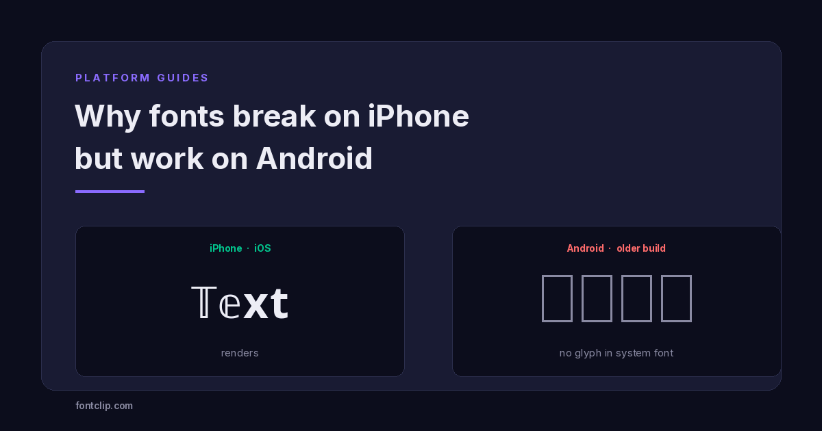 Platform Guides
Why Some Fonts Break on iPhone but Work on Android
The character is identical on both platforms. What differs is the font stack: iOS ships one, Android ships hundreds.
Read article →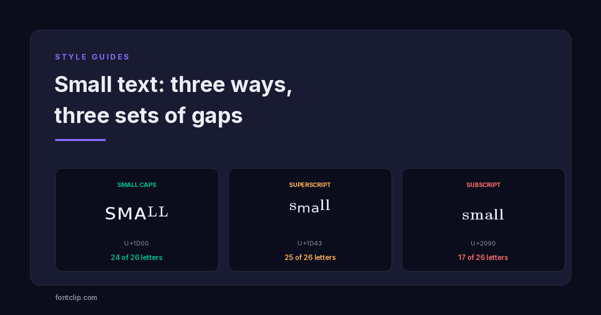 Style Guides
Small Text: Small Caps vs Superscript vs Subscript
Three Unicode small-text styles, and the letters each one is missing. Small caps has no Q or X. Subscript is missing nine.
Read article →Put It Into Practice
285 named, tested styles — with an honest note wherever one has limits.
Open the generator →