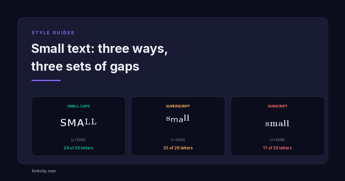
Small text — or tiny text, as it is often called — has an unusual problem. There are three different Unicode ways to make it, they look similar at a glance, and all three are missing letters — but not the same letters.
Type a word containing a Q in small caps and you get a gap where the Q should be. Use subscript for anything longer than a couple of words and roughly a third of the alphabet simply is not there.
This guide covers what each style actually contains, which letters are missing from each, and the one case where you should ignore Unicode entirely and use a built-in feature instead.
The three small-text styles
They are visually distinct once you know what to look for, and they come from unrelated parts of the Unicode standard.
Small caps
Letters shaped like capitals but sized like lowercase. This is the most readable of the three and the one that looks deliberate rather than gimmicky. Most of these characters come from the U+1D00 Phonetic Extensions block, which exists because linguists needed them for the International Phonetic Alphabet.
Superscript
Raised, genuinely tiny text that sits above the baseline. These are scattered across several blocks — some in U+1D43 Phonetic Extensions, others in U+2070 Superscripts and Subscripts. They were encoded for mathematical notation and phonetic transcription, not decoration.
Subscript
Lowered letters sitting below the baseline, mostly from U+2090 Superscripts and Subscripts. This is the smallest set by a wide margin and the one most likely to fail you mid-word.
The missing letters, style by style
Here is the part that catches people out. None of these three styles is a complete alphabet, and the gaps are not documented anywhere obvious — you discover them when a word comes out wrong.
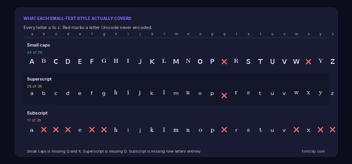
Small caps is missing Q and X
Twenty-four of twenty-six letters exist. The two absent ones are Q and X.
This is a consequence of where the characters came from. The small-caps letters were encoded for phonetic notation, and the IPA had no need for a small-capital Q or X. Nobody was thinking about aesthetic usernames in the 1990s, so the gaps were never filled.
Most generators paper over this by substituting a normal lowercase q and x, which is why a small-caps word containing either letter looks subtly inconsistent — one letter is a different height from the rest.
Superscript is missing Q
Twenty-five of twenty-six. Only Q is absent, for the same reason.
Superscript is the most complete of the three, which makes it a reasonable default if you need something small and your text happens to avoid the letter Q.
Subscript is missing nine letters
Only seventeen of twenty-six letters exist. Missing entirely: b, c, d, f, g, q, w, y and z.
That is a third of the alphabet, and it includes several common letters. The word "background" cannot be written in subscript at all. Neither can "day", "big", or "why".
Practical consequence: subscript is not a general-purpose style. It works for short phrases you have checked letter by letter, and fails silently the moment you use it for anything longer. If a generator shows you subscript output with no gaps, it is substituting plain letters for the missing ones.
Discord: use the built-in feature, not Unicode
A large share of people searching for small text want it for Discord specifically. If that is you, the most common advice online is wrong — or at least, it is answering a different question than the one you are asking.
Discord has a native subtext feature. Start a line with -# followed by a space, and the rest of that line renders smaller and greyed out. No generator, no Unicode, no copy-paste.
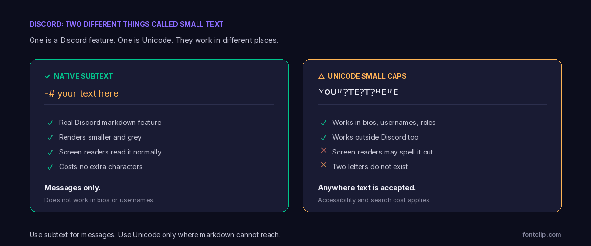
The native version is better in every way that matters. It renders identically for everyone, screen readers announce it as ordinary text, it costs no extra characters, and it cannot break on an older device because it is not a character at all — it is formatting.
The catch, and it is a real one: subtext only works in messages. It does not work in your bio, your username, your display name, or server and channel names. Those fields do not process markdown.
So the honest rule for Discord is a split one. In messages, use -#. In profile fields, where markdown does not reach, Unicode small caps is your only option — and you accept the accessibility and search costs that come with it. Our Discord font generator covers the styles that work in those fields.
Where each style is worth using
An opinionated take, since a list of options is less useful than a recommendation.
Small caps
The default choice. Most readable, widest coverage, looks intentional rather than novelty. Good for usernames, role names, and section headers in a bio.
Superscript
The smallest of the three, which is the point if tiny text is what you are after. Works for a short tagline or a decorative line under a name. Hard to read at length.
Subscript
Only for short phrases you have verified. With nine letters missing it is unreliable for anything you have not checked character by character.
Why small text renders more reliably than most styles
There is a genuine technical advantage here that is worth knowing, because it runs opposite to what you might expect.
Most styled alphabets — bold, italic, script, fraktur — live in the Mathematical Alphanumeric Symbols block above U+FFFF. Small caps, superscript and subscript mostly sit below U+FFFF, in blocks that have been part of Unicode far longer.
Two practical consequences follow.
First, font support is better. These blocks were added earlier and are needed for phonetic and mathematical typesetting, so they reached system fonts sooner and more completely. Small text is less likely to render as empty boxes than script or fraktur.
Second, they cost half as much against character limits. Platforms count UTF-16 units, and characters below U+FFFF take one unit rather than two. A small-caps bio uses roughly the same budget as plain text, where a script bio uses double. If you are working against a tight limit, this matters more than it sounds — character limits on every platform goes through the arithmetic.
The accessibility cost is still real
Better rendering does not mean no downside. These are still substituted characters rather than styled letters, and everything that follows from that still applies.
A screen reader encountering small-caps text may announce the individual character names, spell the word out letter by letter, or skip it. Search will not match it against a plain-text query. Someone trying to type your username cannot reproduce it from a keyboard.
This is the reason the Discord split above matters so much. The native subtext feature has none of these costs, because it is real formatting applied to real letters. Using Unicode where a formatting option exists means paying a price for no benefit. The full accessibility picture covers what assistive technology actually does with these characters.
Checking a style before you commit to it
Given the gaps, a two-minute check saves a lot of irritation.
- Write out the exact text you intend to use, not a sample. The gaps only appear when you hit a missing letter.
- Look for height inconsistencies. If one letter sits at a different height from its neighbours, that is a substituted plain character filling a gap.
- Check it on a second device if you can, ideally an Android phone. Support is good but not universal.
- Paste it into the actual field and save, then refresh. Some fields silently reject or strip unusual characters.
Where small text works outside Discord
Discord dominates the search interest, but these styles are used elsewhere and behave differently depending on the field.
Small caps works in the bio and display name. It does not work in the username, because Instagram restricts handles to letters, numbers, periods and underscores and rejects anything else outright. That rejection is at least honest — you find out immediately rather than discovering later that nobody can find you.
TikTok
Works in the bio and nickname. With an 80-character bio limit, the fact that small text costs one unit per character rather than two is a meaningful advantage here — you get roughly twice as much styled text as you would with script or fraktur.
X and LinkedIn
Both accept small caps in bios and display names. LinkedIn is worth a specific caution: it is a professional context where search matters a great deal, and a styled headline is invisible to recruiters searching for job titles. The full style list is more useful there for a single accent than a whole line.
Where it usually fails
Form fields with validation, email subject lines that get processed by filters, and anything that will be read aloud or indexed. The pattern is consistent: styled text survives wherever text is displayed and struggles wherever text is processed.
Why these characters exist at all
A short digression that explains most of the oddities above.
None of these characters were created for decoration. Small caps and most superscript letters come from Phonetic Extensions, added to Unicode so linguists could write the International Phonetic Alphabet without inventing custom fonts. Subscripts and the remaining superscripts come from a block built for mathematical and chemical notation — the kind of thing you need to write H₂O or xⁿ.
That origin explains the gaps precisely. The IPA never needed a small-capital Q, so one was never encoded. Chemistry rarely needs a subscript W, so there is not one. The sets are complete for their intended purpose and incomplete for ours.
It also explains why the gaps will probably never be filled. Unicode adds characters when there is a documented need in real text, not when aesthetic users would find it convenient. A proposal to add small-capital Q purely so usernames look neater would not meet that bar.
The short version
- Three Unicode small-text styles exist: small caps, superscript and subscript. None is a complete alphabet.
- Small caps is missing Q and X. Superscript is missing Q. Subscript is missing nine letters: b, c, d, f, g, q, w, y, z.
- Generators fill gaps with plain letters, which is why some words look inconsistent in height.
- On Discord, use the native
-#subtext in messages. It has none of the costs. Unicode is only needed in bios and usernames, where markdown does not work. - These styles sit below U+FFFF, so they render more reliably than script or fraktur and cost half as much against character limits.
- The accessibility and searchability costs still apply, because these are substituted characters rather than formatting.
You can try all three styles on the small text generator, which flags the missing letters rather than silently substituting them. For styles that survive the widest range of devices, see why some fonts break on iPhone but work on Android.
Related Articles
 Unicode Explained
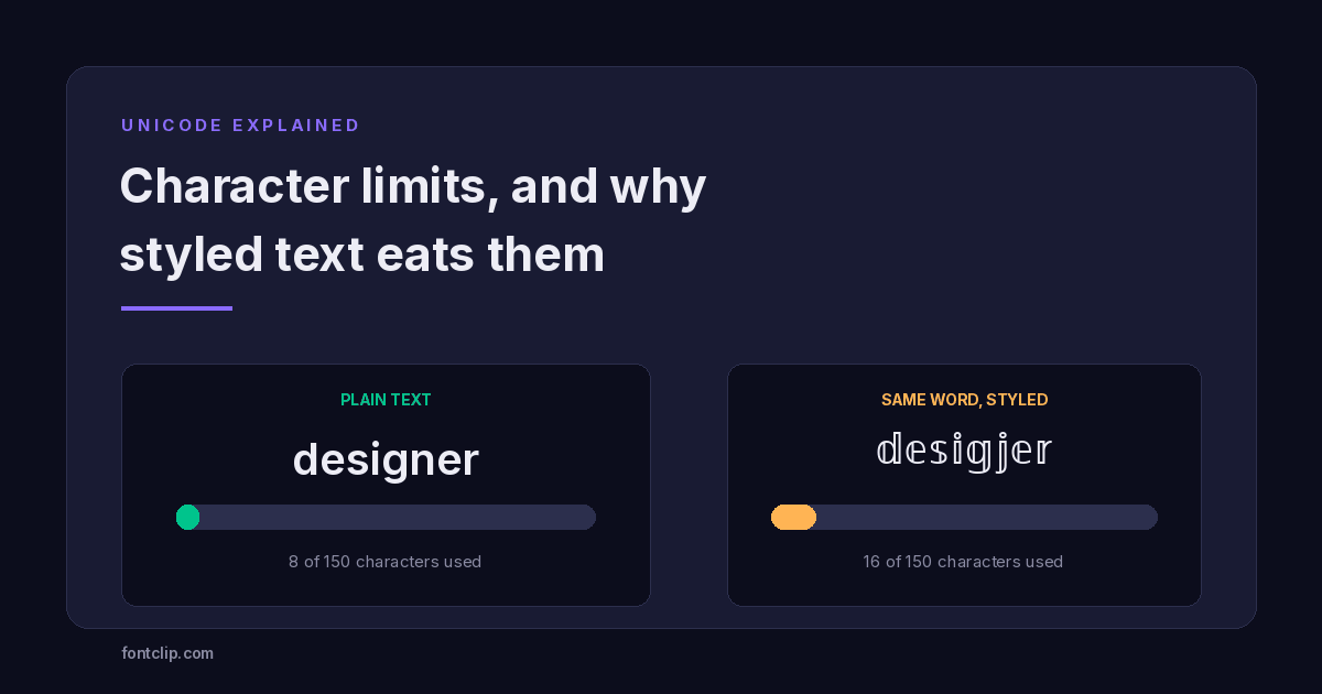
Character Limits on Every Platform (and Why Styled Text Eats Them)
Instagram 150, TikTok 80, Discord 190. Why a styled bio hits the limit long before the letters run out.
Read article → Platform Guides
Discord Fonts: Three Systems and Which Fields They Reach
Markdown, Nitro styles and Unicode reach different fields. Which works where, and which styles render as boxes for everyone else.
Read article → Accessibility
Are Fancy Fonts Accessible? What Screen Readers Actually Read
Styled text swaps letters for different Unicode characters. What screen readers announce, and where to draw the line.
Read article →Put It Into Practice
285 named, tested styles — with an honest note wherever one has limits.
Open the generator →