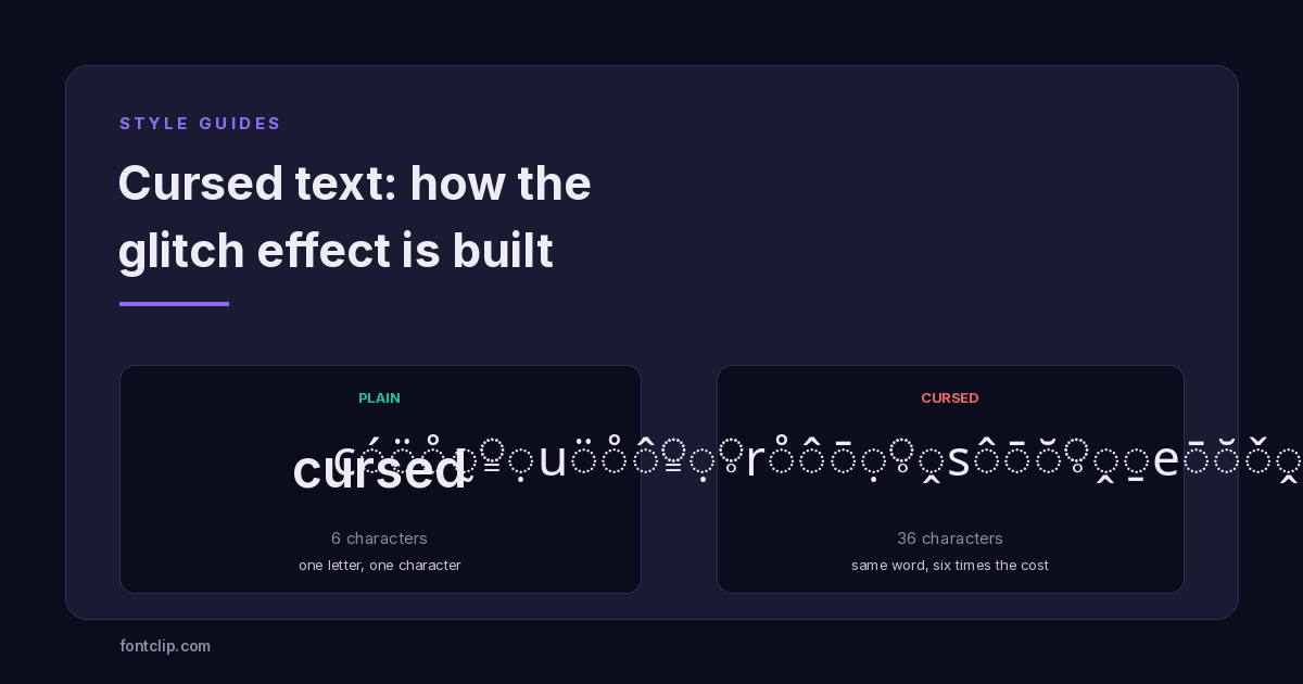
Cursed text works differently from every other style on this site, and the difference explains everything about where it succeeds and where it falls apart.
Bold, script and fullwidth all work by substitution: your letter is swapped for a different Unicode character that happens to look like a styled version of it. Cursed text does not substitute anything. Your letters stay exactly as they were, and extra characters are piled on top of them.
That single architectural difference is why cursed text can look spectacular in a Discord message and be completely unusable in an Instagram bio.
What is actually happening
The effect is built from combining marks — Unicode characters that have no width of their own and attach to whatever character precedes them.
They exist for legitimate linguistic reasons. Many languages need accents, and rather than encoding every possible letter-and-accent combination separately, Unicode lets you write the base letter and then add the mark. That is how Vietnamese, which stacks multiple diacritics on single vowels, is written.
Cursed text takes that mechanism and abuses it. Instead of one accent, it applies ten or twenty, and instead of linguistically meaningful ones, it picks them at random.
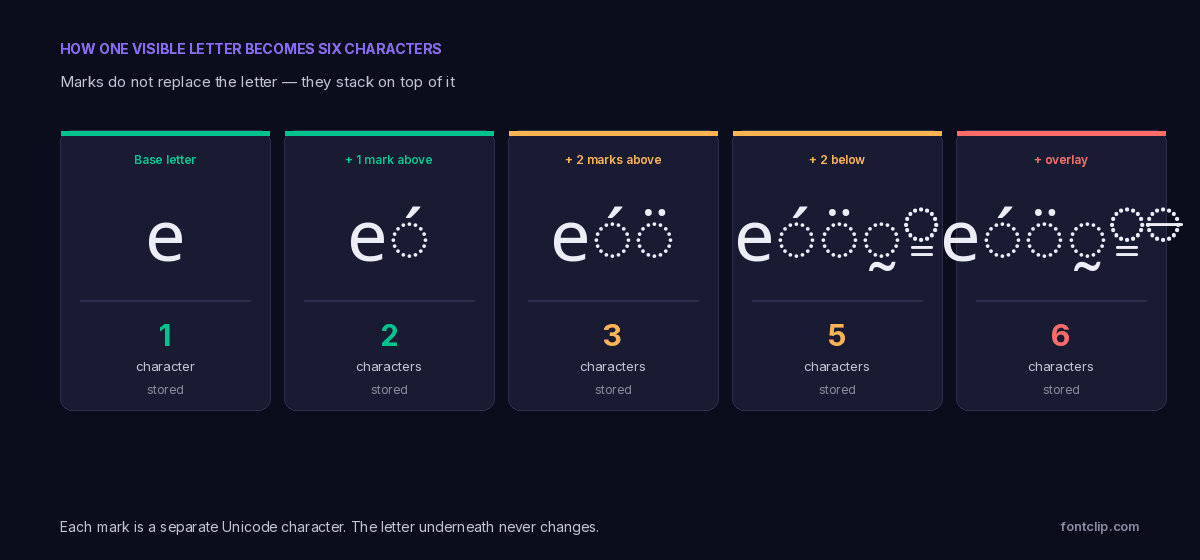
Notice what this means for anything reading the text rather than displaying it. The underlying letters are untouched — the word "cursed" is still literally the letters c, u, r, s, e, d, with debris attached. That is genuinely different from bold or script text, where the letters have been replaced by lookalikes.
The 256 marks available
Cursed text generators draw from five Unicode blocks, holding 256 combining marks between them.
- U+0300 Combining Diacritical Marks — 112 marks. The main set, and the source of most of what you see.
- U+1AB0 Combining Diacritical Marks Extended — 31 marks.
- U+1DC0 Combining Diacritical Marks Supplement — 64 marks.
- U+20D0 Combining Diacritical Marks for Symbols — 33 marks, intended for mathematical notation.
- U+FE20 Combining Half Marks — 16 marks, for marks spanning two characters.
Within the main U+0300 block the marks split by where they render. 51 sit above the base character and 39 sit below it, with the rest overlaying or enclosing it. Generators typically mix all three groups, which is what produces the characteristic spilling-in-every-direction look.
The intensity slider on most generators is doing something simple: choosing how many marks to attach per letter. Light might be two or three; maximum might be twenty or more.
The cost is six times, not double
Every styled Unicode style carries a character cost. Cursed text carries by far the largest, and it is worth being precise about the scale.
Most styled alphabets sit above U+FFFF and cost two storage units per letter — double plain text. That is the figure people usually have in mind.
Cursed text is not doubled. At a typical setting of five marks per letter, the word "cursed" — six letters — becomes 36 stored characters. That is six times the cost, and heavier settings push it higher still.
Six visible letters, thirty-six characters of budget. This is why cursed text and profile fields do not mix.
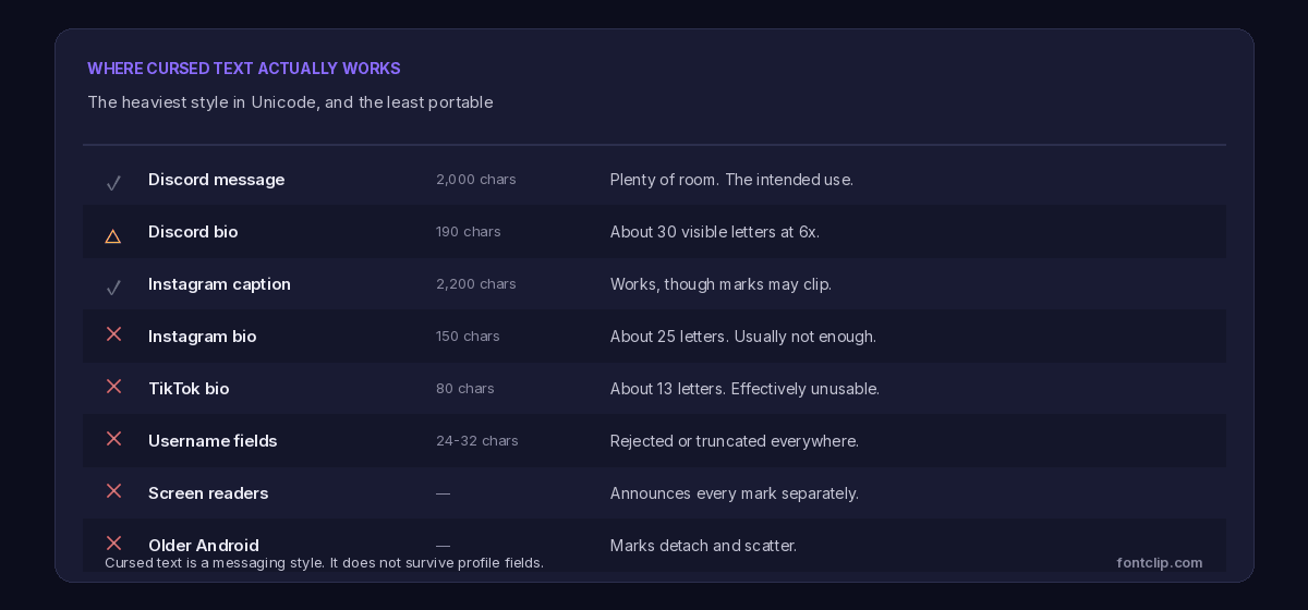
Against a 2,000-character Discord message that is irrelevant. Against a 150-character Instagram bio it means roughly 25 visible letters, and against an 80-character TikTok bio, about 13. The full arithmetic is in character limits on every platform.
Where it works and where it does not
Cursed text has the narrowest useful range of any style covered on this site. It is worth being blunt about that rather than presenting it as a general-purpose option.
Messages: this is the intended use
A Discord message allows 2,000 characters. Even at six times cost you have room for a couple of hundred visible letters, which is far more than anyone sends in cursed text. This is where the style belongs.
Profile fields: usually not viable
A Discord About Me at 190 characters gives you about 30 visible letters. An Instagram bio at 150 gives about 25. A TikTok bio at 80 gives roughly 13 — not enough for a short sentence.
Worse, truncation here is genuinely destructive. If a platform cuts the text at its character limit, it can sever a base letter from its marks, leaving orphaned diacritics floating against the following character. The result is not a clean cut-off but visible wreckage.
Usernames: rejected outright
Instagram, Discord and TikTok all restrict username characters. Combining marks are rejected or stripped. This is the one case where the platform being strict is doing you a favour — a username nobody can type or search for is worse than no username.
Older Android: the marks come apart
Stacking many marks on one base character requires the text renderer to position each one relative to the others. Modern renderers handle this. Older ones, and some budget Android builds, position only the first mark correctly and scatter the rest.
The failure looks different from the usual empty box. Instead of missing characters you get marks drifting sideways across neighbouring letters — recognisably broken rather than simply absent. Our guide to why fonts break differently across platforms covers the rendering side.
The accessibility problem is severe
Every styled text style carries an accessibility cost. Cursed text carries the worst one by a wide margin, and it deserves stating plainly.
A screen reader encountering styled bold text may spell it out or announce character names — irritating, but bounded. A screen reader encountering cursed text has to deal with a base letter followed by five to twenty combining marks, each of which is a real character with a real Unicode name.
Depending on the software, the result is either a long recitation of diacritic names for every single letter, or complete silence. A six-letter word can take a long time to announce and convey nothing.
Worth being direct about: cursed text is the least accessible thing you can put into a text field. If there is any chance the text will be read by someone using assistive technology — a public bio, a server description, a shared post — this style should not be there. In a message to friends who are choosing to look at it, the calculation is different.
There is one small mercy. Because cursed text keeps the original letters rather than substituting lookalikes, a search for the plain word can still match it in some systems — the letters c, u, r, s, e, d are genuinely present. Substituted styles like script lose even that. It is a thin consolation, and it depends entirely on whether the system normalises the marks away before matching. Our accessibility guide goes through what screen readers actually announce.
Why platforms sometimes strip it
You may paste cursed text somewhere and watch it come back clean, or with far fewer marks than you sent. This is deliberate.
Unbounded mark stacking has been used to break layouts — text that overflows its container vertically, covering the interface above and below. It has also been used to bypass keyword filters, since a moderation system searching for a banned word may not match it once it is buried under diacritics.
Platforms responded by capping the number of marks per character or stripping them entirely in certain fields. There is no published standard for this, so behaviour varies: some cap at a handful of marks, some strip everything, some allow it in messages and block it in profiles.
The practical consequence is that cursed text is the least predictable style you can use. Test it in the exact field you intend to use it in, because behaviour differs field by field even within one platform.
Why the letters survive but the meaning does not
There is a subtlety here worth drawing out, because it separates cursed text from every other style and has real consequences.
When you write a word in script, the letters are gone. The character that looks like a fancy A is a different character with a different identity, and no amount of processing will turn it back into an A without a deliberate conversion step.
When you write a word in cursed text, the letters are all still there. A system that strips combining marks — which Unicode normalisation can do — recovers the original word exactly. The word was never encoded differently; it was decorated.
This is why cursed text is sometimes stripped rather than rejected. A platform that wants the plain text can simply remove the marks and keep the letters. With substituted styles there is nothing to strip, so platforms either accept them or block them entirely.
It also means cursed text offers no privacy or filter evasion in systems that normalise properly. The word underneath is intact and trivially recoverable, which is precisely why moderation systems that normalise before matching are unaffected by it.
Zalgo, cursed, glitch: the same thing
These names are used interchangeably and all describe combining-mark stacking. The differences are cultural rather than technical.
Zalgo is the oldest term, from a 2004 internet horror meme in which corrupted text signalled something malevolent breaking through — the creepy effect was the whole point. It usually implies maximum intensity — marks in every direction, text overflowing its line.
Cursed text is the current general term, and tends to describe moderate settings that stay readable. A creepy text generator is usually the same tool under a different name, aimed at people who want the horror association without the Zalgo reference.
Glitch text is used both for this and, confusingly, for image effects that have nothing to do with Unicode — RGB channel splitting, scan lines, datamosh. If you are searching for a glitch text generator, check whether you are being offered characters you can copy or an image you can download. They are entirely different things.
Underneath, all three are the same mechanism at different intensities. A generator offering all three is adjusting one number.
Using it sensibly
Good uses
Discord messages, comments, and anywhere with a generous limit and no processing. A single cursed word inside a plain sentence reads as deliberate.
Poor uses
Any bio, any username, anything public-facing, and anything that matters. The character cost and accessibility cost are both prohibitive.
If you use it anyway
Keep the intensity low. Three or four marks per letter gives the effect while staying legible and roughly halving the cost of a maximum setting.
The short version
- Cursed text stacks combining marks on top of your letters rather than replacing them.
- 256 marks are available across five Unicode blocks; 51 render above the letter and 39 below in the main block.
- It costs roughly six times plain text at typical settings, not double like other styles.
- That makes it viable in messages and unusable in bios, and rejected outright in usernames.
- Older Android renderers scatter the marks instead of stacking them.
- It is the worst style for screen readers, which may announce every mark by name.
- Many platforms cap or strip the marks, and behaviour varies field by field.
- Zalgo, cursed and glitch text are the same mechanism at different intensities.
You can try it on the glitch font generator, which flags combining-mark styles rather than presenting them as equivalent to the rest. For a style with the visual impact but none of the cost, fullwidth text is the opposite extreme — complete, cheap and near-universally supported.
Related Articles
 Unicode Explained
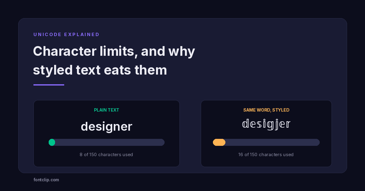
Character Limits on Every Platform (and Why Styled Text Eats Them)
Instagram 150, TikTok 80, Discord 190. Why a styled bio hits the limit long before the letters run out.
Read article →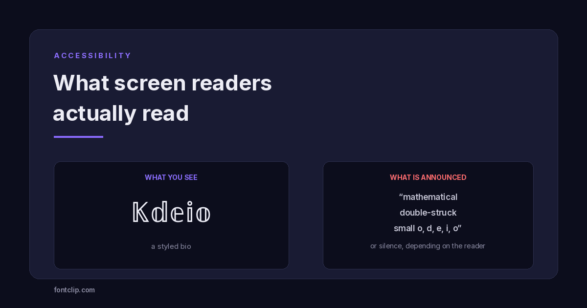 Accessibility
Are Fancy Fonts Accessible? What Screen Readers Actually Read
Styled text swaps letters for different Unicode characters. What screen readers announce, and where to draw the line.
Read article →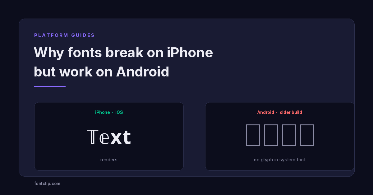 Platform Guides
Why Some Fonts Break on iPhone but Work on Android
The character is identical on both platforms. What differs is the font stack: iOS ships one, Android ships hundreds.
Read article →Put It Into Practice
285 named, tested styles — with an honest note wherever one has limits.
Open the generator →