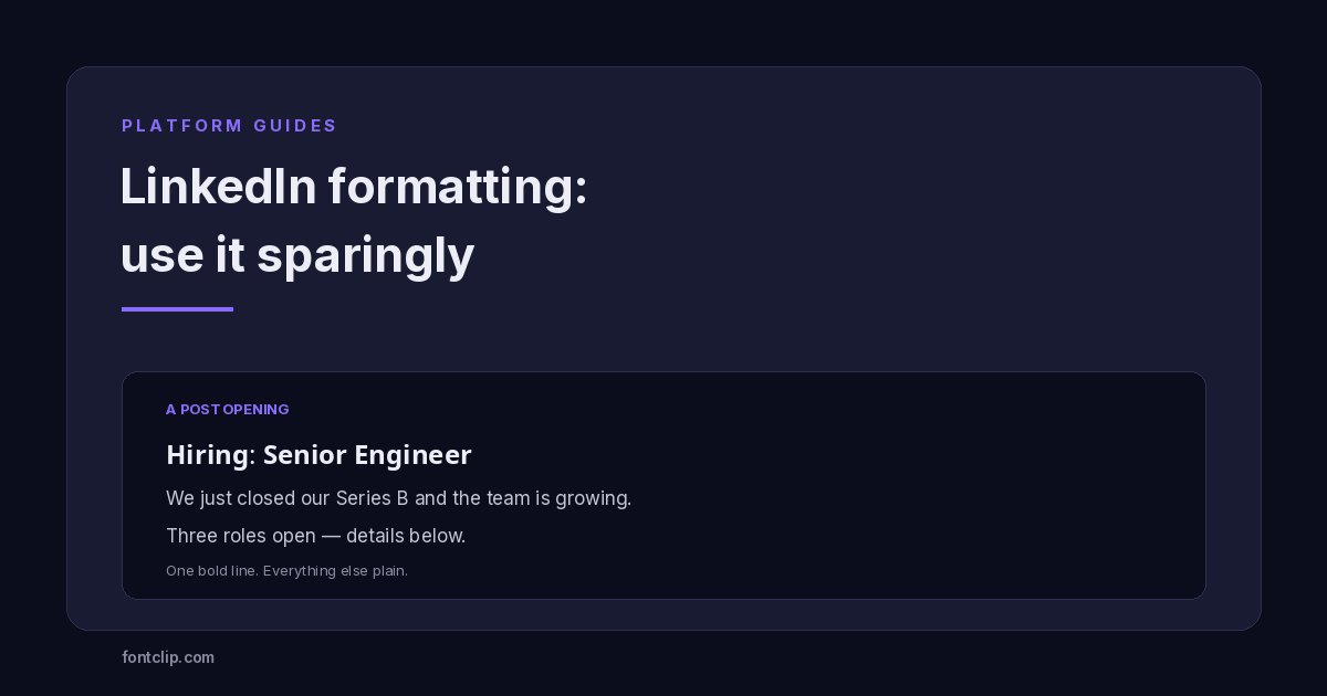
LinkedIn has no formatting buttons. There is no bold, no bullet list, no italic in the post composer — and yet your feed is full of posts with bold opening lines and styled headers. Everyone is using the same workaround, and most of them are using it badly.
The workaround is Unicode: the same substituted characters covered across this site, pasted into a platform that never intended to allow formatting. It works, but LinkedIn is the one platform where the usual costs of styled text are amplified rather than reduced, and using it well means using it far less than most people do.
Why LinkedIn has no formatting
LinkedIn deliberately ships a plain-text composer. The likely reason is the same as Facebook's: a professional feed where anyone could bold their entire post would become an arms race of visual shouting, and the platform that ranks the feed has an interest in preventing that.
So people reach for Unicode. A "LinkedIn text formatter" is not a LinkedIn feature — it is a tool that swaps your letters for characters from the Mathematical Alphanumeric Symbols block that happen to look bold or italic. LinkedIn cannot easily block them, because they are ordinary characters that also serve mathematics and other legitimate writing. The standard treats them as distinct characters, not as formatting, which is precisely why they survive being pasted into a plain-text field.
That is why the situation is stable: the demand for formatting is real, the official answer is no, and Unicode is the loophole that fills the gap.
The costs are higher here
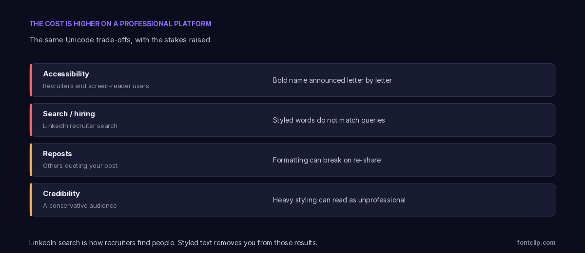
The technical downsides of styled text are identical everywhere. What changes on LinkedIn is the stakes.
Recruiter search
This is the big one. LinkedIn's search is how recruiters, clients and collaborators find people, and it matches characters, not shapes. A headline or post written in bold Unicode will not match a plain-text search for those same words.
If your headline says "𝗦𝗲𝗻𝗶𝗼𝗿 𝗗𝗮𝘁𝗮 𝗘𝗻𝗴𝗶𝗻𝗲𝗲𝗿" in bold characters, a recruiter searching "senior data engineer" may never see you. On a platform whose entire value is being found professionally, that is the most expensive mistake styled text can cause — and the one people least expect.
Accessibility
LinkedIn has a large audience using screen readers, including recruiters and people with disabilities the platform explicitly serves. Bold Unicode is announced letter by letter or skipped entirely, so a styled headline can be unreadable to exactly the people a professional profile most needs to reach. The accessibility guide covers what assistive technology does with these characters.
Credibility
This one is subjective but real. LinkedIn's audience skews conservative and professional. A single bold line reads as organised; a post covered in script, circled letters and decorative symbols reads as trying too hard, and on a platform where you are presenting professional judgement, that impression carries a cost the same styling would not carry on TikTok.
Which styles suit a professional post
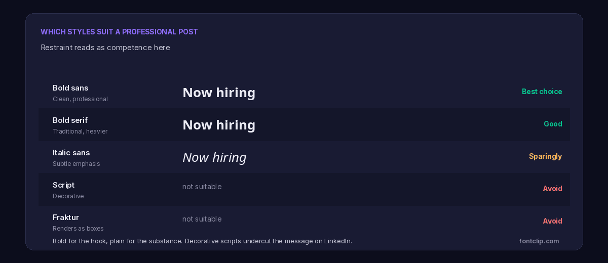
Bold sans is the right default. It reads as clean emphasis, matches LinkedIn's own interface typography reasonably well, and does not look decorative. Use it for a post's opening line or a section header.
Bold serif works too, slightly more traditional and heavier. Fine for the same purposes.
Italic sans is acceptable in small doses — a single emphasised phrase — but italic Unicode has a specific gap worth knowing: the italic serif lowercase "h" does not exist as a styled character in the math alphanumerics block and falls back to an unrelated symbol. Italic sans avoids that, but check any italic text for odd letters before posting.
Script, fraktur and decorative styles should be avoided here. Script carries no digits, fraktur renders partly as boxes because five of its capitals live in a separate Unicode block, and both read as informal in a way that works against a professional post.
Never style your headline or name
One placement deserves a rule of its own, because it is both common and genuinely damaging: the headline and name fields.
Your LinkedIn headline is one of the most heavily weighted fields in the platform's search. It is what recruiters query against, what appears next to your name everywhere on the site, and what LinkedIn uses to categorise you. Styling it in bold Unicode removes it from search results for those exact words — the single most self-defeating thing styled text can do on a professional network.
The name field is worse still. Like Facebook, LinkedIn treats your name as an identifier and expects a real one. Styled characters there can look unprofessional to anyone viewing your profile and may interfere with how connections and colleagues find you. Both fields should stay plain, always.
If you want emphasis in your presentation, it belongs in the body of a post, never in the fields the platform uses to identify and index you.
What styled text costs against the post limit
LinkedIn posts allow 3,000 characters, which sounds generous enough that character cost seems irrelevant. It usually is — but the mechanism is worth understanding because it interacts with how the post is truncated.
Bold and italic characters sit above U+FFFF and cost two storage units each, so a styled line consumes twice its visible length against that 3,000. More importantly, LinkedIn truncates a post in the feed after roughly 200 characters with a "see more" prompt. If you spend those opening characters on styled text, you are spending your most valuable real estate — the part everyone sees before deciding whether to expand — on characters that cost double and cannot be searched.
The efficient move is a short bold hook well within that first truncation window, then plain text carrying the substance. It keeps the searchable keywords in the part of the post that expands, where length no longer matters.
The approach that survives on LinkedIn is the most restrained version of the accent pattern used everywhere else on this site.
One bold line, everything else plain
Bold the single most important line — usually the hook or the ask. Leave the entire rest of the post in plain text. This gives you the visual hierarchy LinkedIn's plain composer denies you, without sacrificing searchability on the words that matter or reading as unprofessional.
The reason this works is that the plain text carries your searchable keywords and your actual message, while the one bold line does the job a heading tag would do if LinkedIn allowed one. You get the benefit and pay almost none of the cost.
The failure mode is the opposite: bolding the whole post, adding italic sub-sections, dropping in bullet-like symbols and section dividers until the post is more formatting than content. It looks busy, it is unsearchable, and it reads as a template.
Bullet points and dividers
Two related workarounds are worth a specific note, because they are everywhere on LinkedIn.
Bullet points: since LinkedIn has no list formatting, people paste bullet characters (•, ▸, ✓) at the start of lines. These are ordinary Unicode symbols and render reliably, so they are one of the safer workarounds — a genuine symbol rather than a substituted alphabet. They stay readable and do not break search, since the words after them are plain.
Section dividers — lines of ─ or ═ characters — also render reliably and cause no searchability problem, since they contain no words. These are the two workarounds that carry little downside, because they add symbols rather than replacing your letters.
The distinction is the same one that runs through this whole site: adding a symbol is cheap; substituting your actual text is expensive.
Does formatting actually help engagement?
The premise behind every LinkedIn text formatter is that formatted posts perform better. It is worth being honest about how thin the evidence for that is.
What is clearly true is that a post which is easy to scan holds attention longer than a wall of text, and a bold opening line plus short paragraphs helps scanning. What is far less clear is that Unicode styling specifically drives reach — LinkedIn does not publish how its ranking treats these characters, and the correlation people cite between formatted posts and engagement is confounded by the fact that people who format their posts also tend to write more deliberately.
The defensible position is modest: a single bold line and clean paragraph breaks aid readability, which may indirectly help engagement. Heavy decorative styling does not, and carries the search and accessibility costs above. If formatting helps, it helps through clarity, and clarity is achieved with restraint rather than volume.
That framing also protects you from the real risk, which is treating styling as a growth hack and burying a genuinely good post under formatting that makes it unsearchable and harder to read for a meaningful share of the audience.
The short version
- LinkedIn has no built-in formatting, so "LinkedIn text formatter" tools use Unicode substitution — the same characters covered across this site.
- The costs are higher here: styled text is invisible to recruiter search, which is LinkedIn's core function.
- Screen-reader users, whom the platform explicitly serves, cannot read styled characters.
- Heavy styling reads as unprofessional to a conservative audience in a way it would not on other platforms.
- Bold sans is the safe default. Avoid script and fraktur entirely; use italic sparingly and check for missing letters.
- Bold one line, keep the rest plain. This gives hierarchy without sacrificing search or credibility.
- Bullet and divider symbols are low-risk because they add characters rather than substituting your words.
The bold and italic styles that suit LinkedIn are on the bold font generator and italic font generator. For how the same styles behave on platforms with a very different audience, see the Discord and Facebook guides.
Related Articles
 Platform Guides
Discord Fonts: Three Systems and Which Fields They Reach
Markdown, Nitro styles and Unicode reach different fields. Which works where, and which styles render as boxes for everyone else.
Read article →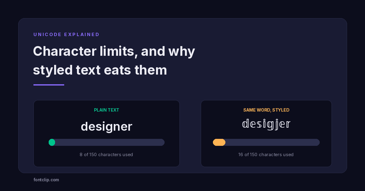 Unicode Explained
Character Limits on Every Platform (and Why Styled Text Eats Them)
Instagram 150, TikTok 80, Discord 190. Why a styled bio hits the limit long before the letters run out.
Read article →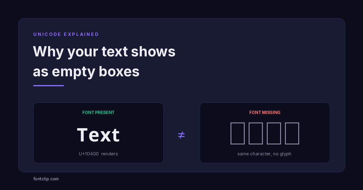 Unicode Explained
Why Your Fancy Text Shows as Boxes (and How to Fix It)
Empty boxes mean the reading device has no glyph for a character. How to tell tofu apart from U+FFFD and U+FFFC, and which Unicode blocks survive everywhere.
Read article →Put It Into Practice
285 named, tested styles — with an honest note wherever one has limits.
Open the generator →