Facebook Fonts: Where Styled Text Works and Where It Is Rejected
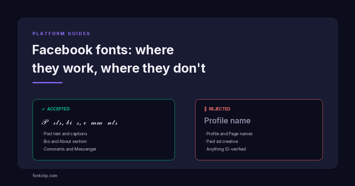
Facebook is unusual among the platforms covered on this site. Most of them either accept styled Unicode text or quietly reject it. Facebook does both, in different fields, for different reasons, and the reasons are worth understanding because one of them can cost you money.
Any Facebook font changer produces the same thing: Unicode characters that look styled. They work in posts, comments, bios and Messenger, and are rejected in profile names, Page names and paid ads. That split is not arbitrary — it follows a single principle that also predicts how Facebook will treat anything new.
Where it works and where it does not
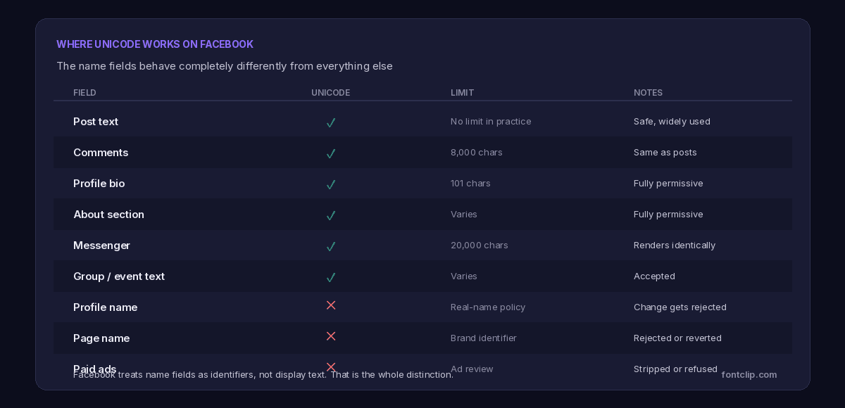
The principle is that Facebook distinguishes between display text and identifiers. A post is something you wrote. A profile name is a claim about who you are, and Facebook treats it as closer to a legal field than a creative one.
Once you see the distinction, the behaviour stops being surprising. Anything Facebook uses to establish identity rejects styling. Anything Facebook simply shows to other people accepts it.
The real-name policy blocks styled profile names
Facebook's name policy requires profile names to be the name you use in everyday life. That policy predates the current popularity of styled text and was built to address impersonation and anonymous accounts, but it catches Unicode styling as a side effect.
When you submit a name change, it goes through review. A styled name is likely to be rejected, and there is a second consequence people do not expect: a rejected name change can trigger a request for photo identification. That review is about the name change itself rather than the styling, but a styled name is a reliable way to invite it.
Reports on which styles pass are inconsistent, which is what you would expect from a review process that is partly automated and partly human. Subtle styles applied to a genuine name — a bold or italic version of the name you actually use — are reported as passing more often than heavily decorated ones. But this is not a documented rule, and I would not describe any style as reliably safe here.
Worth weighing before you try: Facebook limits how often you can change your name, commonly cited as once every 60 days. If a styled name is rejected or later reverted, you may be locked out of changing it back for a while. The bio has no such restriction, which makes it a far better place to experiment.
Page names follow the same logic
A Page name is meant to match how people search for the brand, so it is treated as an identifier too. Styled Page names are rejected or reverted, and unlike a personal profile there is a practical cost: a Page whose name does not match what people type is a Page that is harder to find.
The bio, intro and post text are all permissive, so the styling can go there without touching the name people search for.
The one that costs money: paid ads
This is the most consequential difference on Facebook and the one least likely to be mentioned before it affects you.
Organic posts and paid ads are reviewed by different systems. An organic post containing styled text publishes normally. The same words in an ad go through ad review, where heavy use of unusual characters is treated as a spam signal.

The reasoning is straightforward from Facebook's side. Advertisers have historically used unusual characters to slip past automated review — disguising claims about health products, financial returns, or restricted goods by writing them in characters a keyword filter does not match. Ad review responded by treating non-standard characters as suspicious in themselves.
The practical consequence is that styled text in ad copy risks rejection, delay, or in repeated cases account-level scrutiny. For a business running campaigns, that is a real cost for a purely cosmetic gain.
If you run both organic and paid content from the same account, the rule is simple: style the organic posts if you like, keep the ad copy plain throughout.
Where styled text genuinely works
Having covered the restrictions, the permissive fields are genuinely permissive.
Post text accepts any Unicode block — these are ordinary characters from the Mathematical Alphanumeric Symbols range rather than a Facebook feature. This is the most common use, typically a styled first line acting as a headline above plain body text — which is also the pattern that survives skim-reading best.
Comments behave identically to posts. A pinned comment in styled text is a common way to extend an offer beneath a post.
The bio and About section are the freest fields Facebook has. No name policy applies, and the bio is short enough that character cost rarely matters.
Messenger renders styled text the same way the main app does, so anything that works in a post works in a message.
Facebook's audience changes the calculation
There is an argument for restraint on Facebook that does not apply equally to Discord or TikTok, and it is worth making explicitly.
Facebook's user base skews older than most platforms, and older users are more likely to be on older devices with reduced font coverage. A style that renders perfectly for you may be boxes for a meaningful share of the people you are writing to — and unlike a gaming server, you will not be told.
The same demographic point applies to accessibility. Screen reader use rises with age, and Facebook has a large audience of people using assistive technology to read a feed. Styled text that gets announced letter by letter is not a minor irritation at that scale.
This is not an argument for never styling anything. It is an argument for the accent pattern rather than the whole-post pattern: style the hook, keep the substance plain. Anyone who cannot render or hear the styled part still gets the message.
If you want the full picture of what assistive technology does with these characters, what screen readers actually read covers it, and why fonts break on some devices explains the rendering side.
Which styles to use here
Given an older, more device-varied audience, style choice matters more on Facebook than on platforms with younger users.
Safest
Bold sans and italic sans. Complete alphabets, widest device support, and they read as emphasis rather than decoration.
Usually fine
Script and bold script. Well supported and popular, though they carry no digits, so numbers in a styled line will appear plain.
Avoid here
Fraktur, which is split across two Unicode blocks and renders partly as boxes, and any combining-mark style, which older devices handle badly.
Why Facebook has no built-in formatting
A question worth answering, since it explains why Unicode substitution exists here at all.
Discord has markdown. Slack has formatting buttons. WhatsApp has asterisk syntax for bold. Facebook, despite being older and larger than all of them, has never added text formatting to posts.
The likely reason is consistency of presentation. Facebook's feed is a ranked, mixed stream of content from many sources, and formatting is a lever people would use to make their post shout louder than the one above it. A feed where anyone can bold their entire post is a feed that becomes an arms race, and the platform that controls the ranking has an interest in preventing that.
Unicode substitution is the loophole, and it is what every Facebook font changer relies on. Because these are characters rather than formatting, Facebook cannot remove them without removing the ability to write in the languages those blocks serve. Mathematical notation and phonetic transcription are legitimate uses of the same characters.
That is why the situation is stable rather than temporary. Facebook restricts styling where it can — name fields and ad review, which are gated by policy rather than by character encoding — and permits it everywhere else because blocking it is not technically feasible without collateral damage.
What about search?
The cost that applies everywhere applies here too, with one Facebook-specific wrinkle.
Facebook search matches characters. A styled word in a post will not match a plain-text search for the same word, which matters if you are posting content you want found later — a business announcement, an event, a for-sale listing.
The wrinkle is that Facebook's own name restrictions accidentally protect you here. Because profile and Page names must be plain, the field people actually search for stays searchable whether you like it or not. The platform has enforced the sensible outcome by policy.
For post content, the responsibility is yours. If a post needs to be findable, keep the words that matter in plain text and style the decoration around them.
A practical approach
- Bio and About: style freely. No name policy, no search consequence, no ad review.
- Posts: style the first line as a headline, keep the body plain. Best of both.
- Comments: same as posts. Useful for a pinned comment that needs to stand out.
- Profile and Page names: leave plain. Rejection risk, ID verification risk, and a 60-day lockout if it goes wrong.
- Ads: plain text throughout. This is the one where the cost is measured in money.
The short version
- Facebook accepts styled Unicode in posts, comments, bios, About sections, groups, events and Messenger.
- It rejects styled text in profile names and Page names, because those are treated as identifiers rather than display text.
- A rejected name change can trigger a request for photo ID, and name changes are limited to roughly one every 60 days.
- Paid ads are reviewed separately and heavy Unicode use is treated as a spam signal. Keep ad copy plain.
- Facebook's older audience means more devices with reduced font coverage and more screen reader use, so the accent pattern beats full styling.
- Bold and italic sans are the safest styles. Fraktur is the riskiest because it spans two Unicode blocks.
The styles that work here are on the Facebook font generator. For how the same styles behave on a platform with the opposite audience profile, see Discord fonts and the three systems.
Related Articles
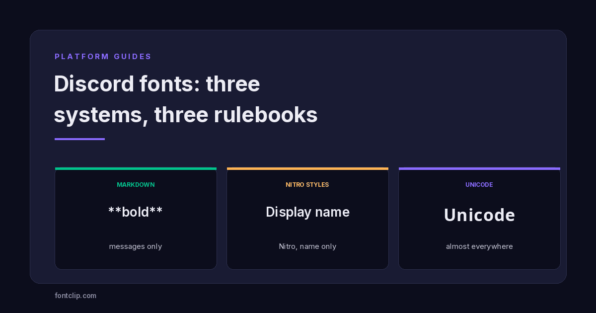 Platform Guides
Discord Fonts: Three Systems and Which Fields They Reach
Markdown, Nitro styles and Unicode reach different fields. Which works where, and which styles render as boxes for everyone else.
Read article →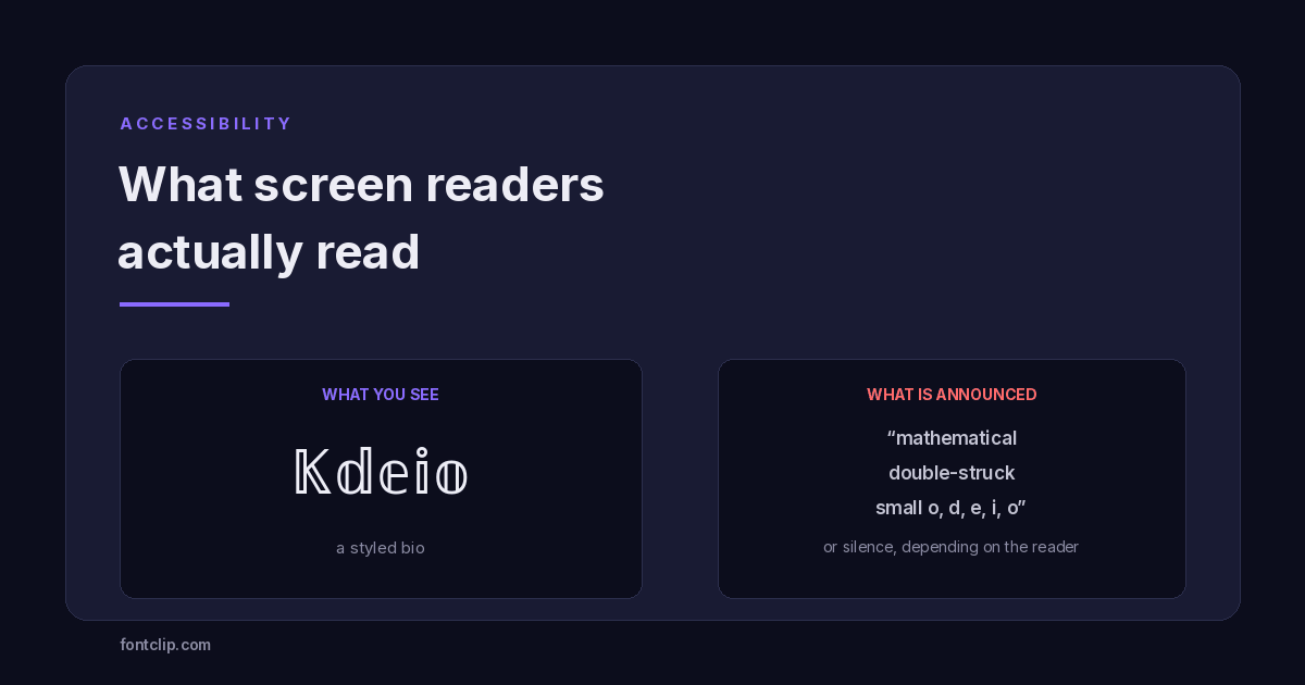 Accessibility
Are Fancy Fonts Accessible? What Screen Readers Actually Read
Styled text swaps letters for different Unicode characters. What screen readers announce, and where to draw the line.
Read article →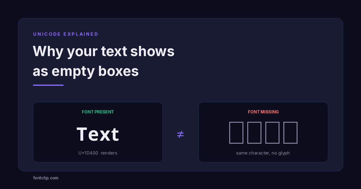 Unicode Explained
Why Your Fancy Text Shows as Boxes (and How to Fix It)
Empty boxes mean the reading device has no glyph for a character. How to tell tofu apart from U+FFFD and U+FFFC, and which Unicode blocks survive everywhere.
Read article →Put It Into Practice
285 named, tested styles — with an honest note wherever one has limits.
Open the generator →