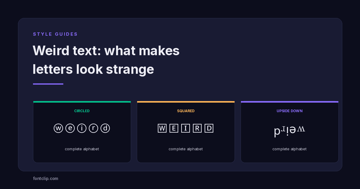
"Weird text" is a loose description rather than a technical category. It covers letters in circles, letters in boxes, letters written upside down, letters with pieces missing — anything that reads as strange rather than merely decorative.
What these have in common is not how they look but where they come from. Most styled text draws on one Unicode block. Weird text pulls from at least six unrelated ones, each encoded for a different reason, and each behaving differently once you paste it somewhere.
One of them has a failure mode that turns your text into country flags. That is not a bug, and it catches people constantly.
The blocks behind weird text
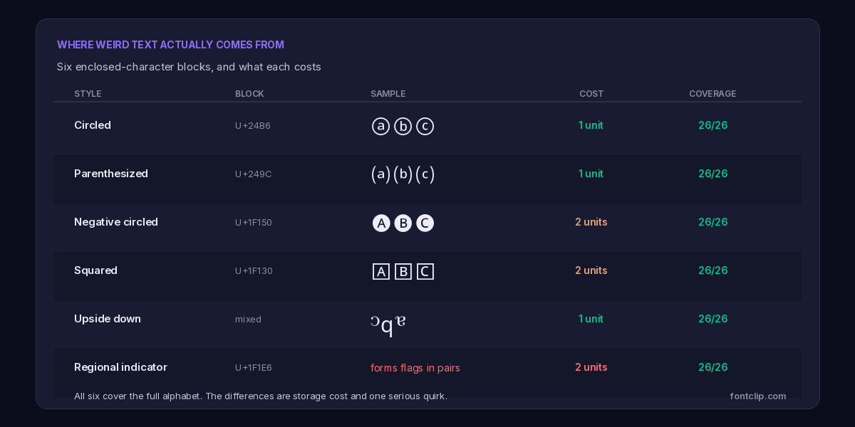
Unlike the mathematical alphabets, which were encoded as one coherent set for equations, these blocks arrived separately over decades and for unrelated purposes.
Circled letters
From U+24B6 Enclosed Alphanumerics, encoded for numbered lists, diagram labels and technical documentation. Complete coverage of capitals, lowercase and digits.
These are the most useful of the group. They sit below U+FFFF, so they cost one storage unit each — the same as plain text — and support is excellent because they have been in Unicode since the early 1990s.
Parenthesized letters
From U+249C, in the same block and encoded for the same documentation purposes. Also one unit each, also well supported.
Visually softer than circled letters, and less commonly used, which makes it a reasonable choice if you want something recognisably styled without looking like every other bio.
Squared and negative squared letters
From U+1F130 Enclosed Alphanumeric Supplement, added much later and sitting above U+FFFF. They cost two units each.
The negative variants — white letters on filled backgrounds — are the heaviest-looking weird text available and the most likely to render inconsistently, because this block arrived alongside emoji and some devices treat it as emoji rather than text.
Upside-down text
The odd one out. There is no upside-down block. The effect is assembled from characters scattered across Latin Extended, IPA Extensions and Greek — the letter "e" flipped is actually U+01DD, a Latin small letter turned e, and "a" flipped is U+0250 from the IPA.
Generators also reverse the character order, so the text reads correctly when the page is turned around. Most of these characters sit below U+FFFF and cost one unit.
Because it is assembled from unrelated characters rather than drawn from one block, coverage depends on which substitutions a particular generator chose. Two upside-down generators can produce different results for the same word.
The regional indicator trap
This is the one worth knowing about before you use it, because the failure is dramatic and completely invisible until it happens.
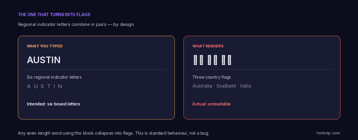
U+1F1E6 Regional Indicator Symbols is a block of 26 boxed letters that look like an appealing squared-letter style. Some generators offer it as exactly that.
The problem is what the block is for. Regional indicators exist to build country flags. Two of them in sequence form the flag for that two-letter country code — and this combination happens automatically, at the font rendering level, everywhere.
So the word "AUSTIN" does not render as six boxed letters. The renderer reads AU, ST and IN as three country codes and displays the flags of Australia, Svalbard and India. Any even-length word using this block collapses this way.
How to spot it: if a generator offers "squared letters" and the preview looks fine but your pasted text turns into flags, this is the block responsible. The genuine squared-letter style is U+1F130, which looks similar and does not combine. Anything that produces flags is regional indicators.
What weird text costs
The storage costs vary more within weird text than within any other style family, which matters if you are working against a character limit.
- Circled, parenthesized and upside-down sit below U+FFFF and cost one unit per character — the same as plain text.
- Squared, negative circled and regional indicators sit above it and cost two units each.
On a tight field like a TikTok bio, that difference is the whole decision. Circled letters give you 80 characters of styled text; squared letters give you 40. The full arithmetic is in character limits on every platform.
Where weird text renders reliably
Support splits along the same line as cost, and for the same reason.
Circled and parenthesized letters have been in Unicode since 1993 and appear in fonts almost everywhere. They are among the safest styled characters you can use — more reliable than script or fraktur, which people assume are safer because they look more ordinary.
The enclosed supplement block at U+1F130 arrived in 2010 alongside the first emoji. Some platforms render those characters as text, others as emoji — coloured, differently sized, and sometimes on their own line. The same squared letters can look completely different on two devices, which is a distinct problem from the empty boxes covered in why fancy text shows as boxes.
Upside-down text is generally well supported, but with a caveat: because it is assembled from unrelated blocks, one substituted character can fail while the rest render. You get a word that is mostly upside down with one letter the right way up.
Using weird text well
Weird text has a narrower useful range than most styles, because strangeness works as an accent and fails as a default.
Best uses
A single word, a divider, or a short username. Circled letters in particular read as deliberate rather than broken.
Poor uses
Whole bios or captions. Every one of these styles is slower to read than plain text, and upside-down text is close to unreadable at length.
Never
Anything you need someone to type, search for, or read aloud. Weird text is the least recoverable style family there is.
Choosing between them
Any weird text generator will offer these styles side by side with no indication that they behave differently. They do, and the differences are worth knowing before you pick one.
If you want something that will render for essentially everyone and cost nothing extra against a character limit, circled letters are the answer. Oldest block, widest support, one unit per character, complete alphabet including digits.
If you want something less common, parenthesized letters occupy the same block with the same properties and appear far less often in bios.
If you want maximum visual weight and can accept inconsistent rendering, the negative squared variants are the heaviest available — but expect them to appear as coloured emoji on some devices and as plain boxed letters on others.
Upside-down text is the only one of the group that genuinely obscures meaning, which is sometimes the point. It is also the only one where different generators produce different output, so text copied from one tool may not match text from another.
What no weird text generator will tell you is that the regional indicator block should not be on the list at all. It is included because it looks like squared letters in a preview, and it fails the moment a word has an even number of characters.
The accessibility cost is higher here
Every styled text style carries an accessibility cost. Weird text carries more than most, and it is worth being specific about why.
Screen readers announce characters by their Unicode names. A circled A is "circled latin capital letter a" — so a five-letter word becomes a long recitation of near-identical phrases. Bold text at least has a chance of being announced as its base letter; enclosed characters usually do not.
Upside-down text is worse still, because the characters are genuinely unrelated to the letters they imitate. A flipped "e" is a turned e from a phonetics block, and a screen reader will announce it as such. The word is not merely hard to hear — it is a different word entirely.
And because generators reverse the character order for upside-down text, the underlying string is backwards. Anything reading it linearly gets the letters in reverse. The accessibility guide covers what assistive technology does with substituted characters in general.
Why these blocks exist at all
None of this was designed for decoration, which explains most of the awkwardness above.
Enclosed alphanumerics exist because technical documents needed numbered and lettered references that survive being copied between systems. Before Unicode, a circled number in a diagram was a font-specific character that turned into something else on another machine.
Regional indicators exist because Unicode needed a way to represent flags without encoding hundreds of individual country symbols and then adjudicating which political entities qualify. Building flags from two-letter codes moved that problem to the ISO country code list.
The upside-down characters exist because phoneticians needed them. A turned e represents a specific vowel sound in the IPA. That it happens to look like an upside-down letter is a coincidence that generators exploit.
In each case the characters do a real job, and the decorative use is a side effect. That is also why the gaps and quirks will not be fixed — Unicode adds characters for documented needs in real text, not to make a generator's output more consistent.
The short version
- Weird text is not one block. It draws from at least six, encoded separately for documentation, flags and phonetics.
- Circled and parenthesized letters cost one unit each and have the best support of any styled characters.
- Squared and negative variants cost two units and may render as emoji on some devices.
- Regional indicator letters combine into country flags in pairs. Any even-length word collapses into flags.
- Upside-down text is assembled from unrelated blocks and reverses the character order, so the stored string is backwards.
- Screen readers announce enclosed characters by their full Unicode names, which is worse than most styles.
- Use it as an accent on one word. It fails as a default for anything longer.
Every style here is on the weird text generator, which flags the regional indicator block rather than offering it as an ordinary squared-letter style. For styles that stay readable at length, small text and fullwidth are the better starting points.
Related Articles
 Style Guides
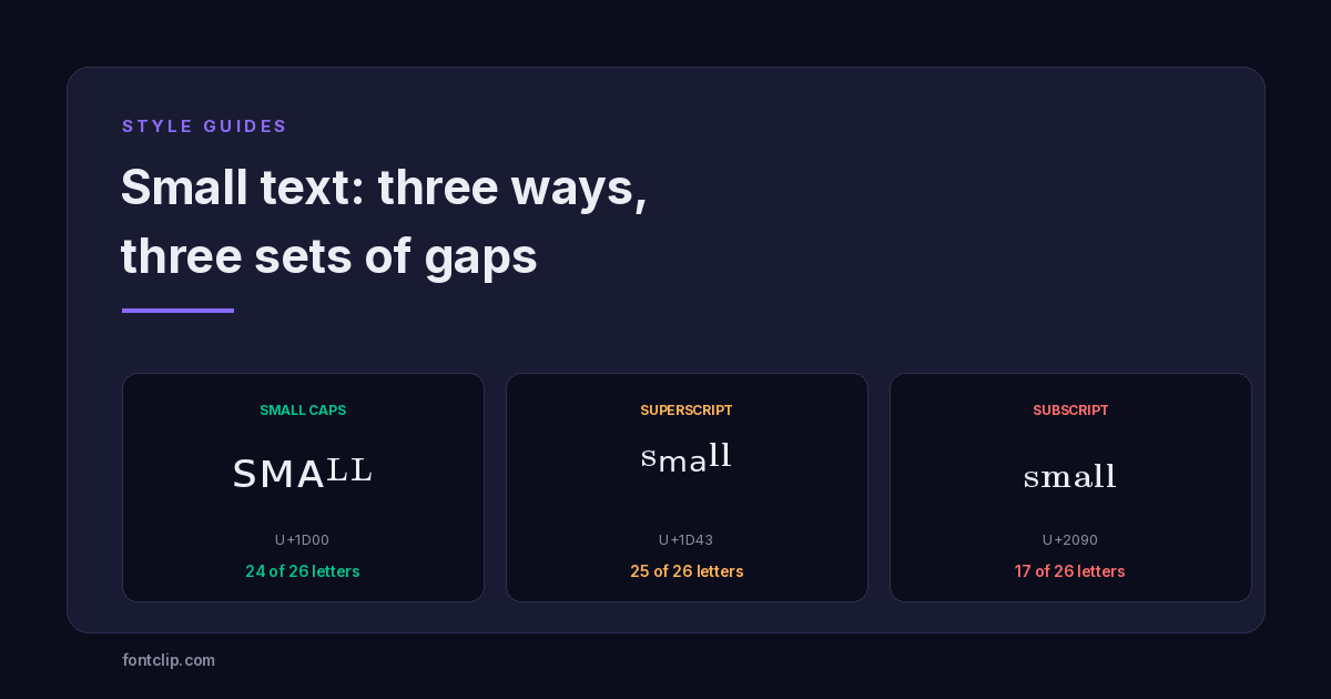
Small Text: Small Caps vs Superscript vs Subscript
Three Unicode small-text styles, and the letters each one is missing. Small caps has no Q or X. Subscript is missing nine.
Read article → Style Guides
Vaporwave Text: The Only Complete Unicode Alphabet
Fullwidth is the only styled block with no missing characters, and it costs the same as plain text. Why, and where to use it.
Read article → Unicode Explained
Why Your Fancy Text Shows as Boxes (and How to Fix It)
Empty boxes mean the reading device has no glyph for a character. How to tell tofu apart from U+FFFD and U+FFFC, and which Unicode blocks survive everywhere.
Read article →Put It Into Practice
285 named, tested styles — with an honest note wherever one has limits.
Open the generator →