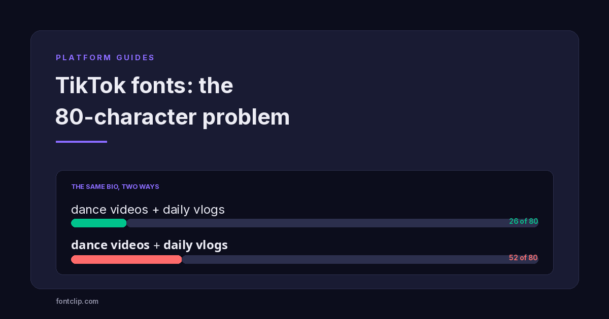
TikTok has the tightest bio on any major platform. Eighty characters, which is roughly one short sentence, and it counts everything — letters, spaces, emoji and line breaks.
That constraint changes the advice completely. On Discord or Facebook you can style a whole bio and barely notice the cost. On TikTok, styling the same text can consume half your budget before you have finished the first line.
This guide covers what each TikTok field accepts, which styles fit the limit, and the two fields where styled text is rejected outright. Any TikTok font generator produces the same underlying thing — characters from the Mathematical Alphanumeric Symbols block and a few others — so the question is never which tool to use but which style survives an eighty-character budget.
Every TikTok field and what it accepts
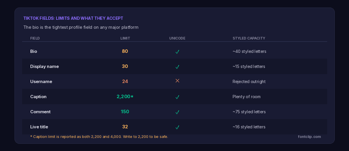
The bio: 80 characters
The tightest field, and the one people most want to style. For comparison, Instagram allows 150 and Discord's About Me allows 190. TikTok gives you less than half of either.
Worth noting: some sources in 2026 report the bio limit has been raised to 160, while others still report 80. I have not been able to confirm which applies to which accounts, so the sensible approach is to write to 80 — a bio that fits 80 works everywhere, while one written for 160 may be silently truncated.
The display name: 30 characters
Separate from your username and far more permissive. It accepts spaces, emoji and Unicode styled characters. This is where most TikTok styling belongs.
The username: 24 characters, no styling
Restricted to letters, numbers, underscores and periods. Styled characters are rejected during validation rather than accepted and broken, so you find out immediately.
TikTok also closed a loophole here recently. Adding a trailing period to a username was a minimalist trend in 2024 and 2025; server-side validation now strips or rejects it.
Captions and comments
Captions accept styled text and have room for it. The limit is reported as both 2,200 and 4,000 characters depending on the source, so write to 2,200 if it matters.
The more important number for captions is not the limit but the truncation point: only the first 100 to 150 characters appear in the feed before a reader has to tap "more". If you style a caption, style the opening, because the rest may never be seen.
Comments cap at 150 characters and accept styled text normally.
Which styles actually fit
This is where TikTok differs from every other platform covered on this site. With 80 characters, the storage cost of a style stops being a technicality and becomes the deciding factor.
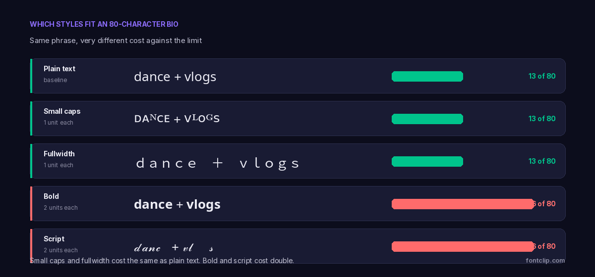
Platforms count UTF-16 storage units rather than visible letters. Characters below U+FFFF cost one unit; characters above it cost two. Most styled alphabets — bold, italic, script, fraktur — sit above that boundary.
So a thirteen-character phrase costs thirteen units in plain text and twenty-six in script. On an 80-character bio that is the difference between having room for a call to action and not.
The styles that cost nothing extra
Three styles sit below U+FFFF and cost exactly what plain text costs:
- Small caps — mostly from the Phonetic Extensions block. Missing Q and X, so check your text.
- Fullwidth — the vaporwave style, complete with no gaps, though visually very wide.
- Circled letters — complete coverage including digits.
Most TikTok fonts offered by generators come from the expensive group rather than this one, because bold and script look more obviously styled. On a platform with eighty characters, that default is working against you.
On TikTok specifically, this makes them the practical default rather than a curiosity. The small text comparison covers the coverage gaps in each, and fullwidth text explains why that block is unusually complete.
Fullwidth has a catch here
Fullwidth costs one unit per character, which sounds ideal for a tight limit. But each character is visually about twice as wide as a normal letter.
The result is that you run out of visible space long before you run out of character budget. A twenty-character fullwidth display name may overflow the field on some devices even though it is well under the thirty-character cap. Use it for a short name, not a full bio line.
The pattern that works on a tight limit
Given eighty characters, styling everything is not viable. The approach that survives is to style one element and leave the rest plain.
A styled name or category on the first line creates visual hierarchy and costs maybe twenty units. The remaining sixty carry the actual information in plain text, which also keeps it searchable.
Styling the whole bio in script costs the entire budget and leaves nothing for a call to action, a location, or a niche — the things that actually make someone follow.
Bio
Style the first line only, in small caps or fullwidth. Keep the rest plain. Budget twenty units for styling at most.
Display name
The best place for a styled look. Thirty characters is enough for a styled name in any block, and it is the field people see first.
Captions
Style the opening line if anything. Everything past roughly 125 characters is hidden behind "more" in the feed.
What styled text costs you on TikTok
The character cost is the visible problem. Two others matter more on a platform built around discovery.
Search stops matching
TikTok search matches characters, not shapes. A styled display name will not match a plain-text search for the same words. On a platform where a large share of discovery happens through search — including people looking for a creator they half-remember — that is a real cost.
The username protects you here, since it cannot be styled. But the display name is what appears in search results, and a heavily styled one is effectively invisible to anyone typing your name normally.
Accessibility
Styled characters are announced oddly by screen readers, spelled letter by letter, or skipped. This applies identically across every platform, and the accessibility guide covers what assistive technology actually does with these characters.
On TikTok the calculation is slightly different because so much content is video. A styled bio is a small part of an experience that is mostly audio and moving images. That does not make it free, but it does mean the bio is not usually the only route to your content.
Styles to avoid on TikTok
Two categories are worth ruling out specifically.
Combining-mark styles — cursed, zalgo and glitch text — cost roughly six times plain text. On an eighty-character bio that leaves about thirteen visible letters, and the truncation can sever a base letter from its marks and leave visible debris. Cursed text is a messaging style, and TikTok has no messaging field that suits it.
Fraktur is risky for a different reason. Five of its capitals live in a separate Unicode block, so a fraktur name can render partly as boxes depending on the viewer's device. TikTok's audience skews mobile-heavy across a very wide range of hardware, which is exactly the condition where partial rendering failures show up. The blackletter guide covers that split.
Testing before you commit
You cannot see a rendering failure on your own device, because your device has whatever font produced the character in the first place. Someone else's phone may not.
This matters more on TikTok than on desktop-heavy platforms. The audience is almost entirely mobile, spread across an enormous range of hardware from current flagships to budget Android devices several years old. Font coverage on those devices varies considerably.
- Save the bio, then reload the profile. Truncation frequently only becomes visible after a refresh, and a bio cut mid-character leaves a broken symbol rather than a clean ending.
- Check the display name in a comment thread, not just on your profile. It renders at a smaller size there, and decorative styles lose legibility fast.
- Ask someone on an older Android device to confirm it renders. This is the single most useful check and the one nobody does.
- Count before you paste. If you are within about ten characters of the limit with styled text, assume you are over it.
The underlying reason styles fail on some devices and not others is covered in why fancy text shows as boxes, which also explains how to tell a rendering failure from a genuinely broken copy.
Why the bio is so short
Worth understanding, because it explains why this constraint is unlikely to loosen.
TikTok treats the profile as a content gallery rather than a description. The videos are the substance; the bio is a caption for them. Eighty characters is enough for a tagline and deliberately not enough for a biography.
The design also reflects where discovery happens. On Instagram, the profile is a destination people browse. On TikTok, most viewers arrive at a video first and visit the profile only if the video worked. A long bio would serve an audience that mostly is not there yet.
That is why the trend across TikTok's fields has been to expand captions — where content lives — while leaving the bio tight.
The short version
- TikTok's bio is 80 characters, the tightest of any major platform. Some 2026 sources report 160; write to 80 to be safe.
- Display name is 30 characters and accepts Unicode. Username is 24 and rejects it outright.
- Most styled alphabets cost two units per letter, so a styled bio holds about 40 visible characters.
- Small caps, fullwidth and circled letters cost one unit each — the same as plain text.
- Fullwidth is cheap in characters but visually wide, so it overflows the display name before hitting the cap.
- Style one element, keep the rest plain. Eighty characters cannot carry both styling and information.
- Avoid combining-mark styles entirely here, and treat fraktur as risky on mobile.
The styles that fit an 80-character bio are on the TikTok font generator. For the full arithmetic behind why some styles cost double, see character limits on every platform.
Related Articles
 Unicode Explained
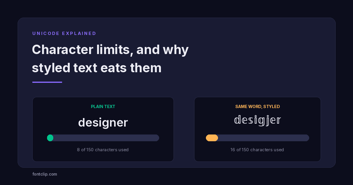
Character Limits on Every Platform (and Why Styled Text Eats Them)
Instagram 150, TikTok 80, Discord 190. Why a styled bio hits the limit long before the letters run out.
Read article →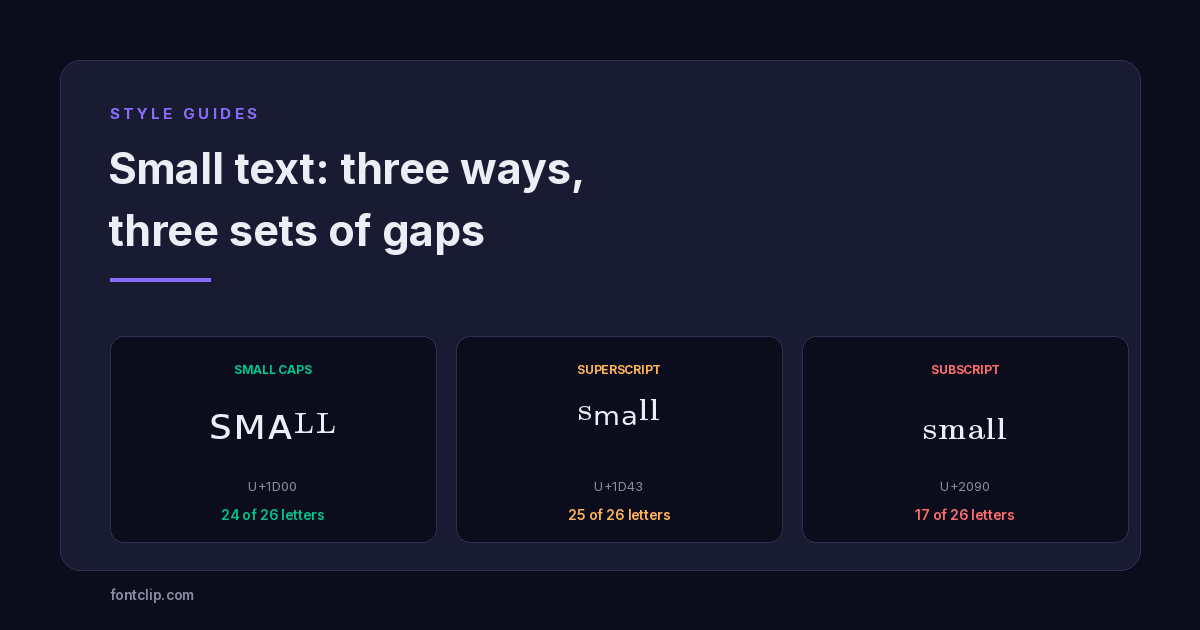 Style Guides
Small Text: Small Caps vs Superscript vs Subscript
Three Unicode small-text styles, and the letters each one is missing. Small caps has no Q or X. Subscript is missing nine.
Read article →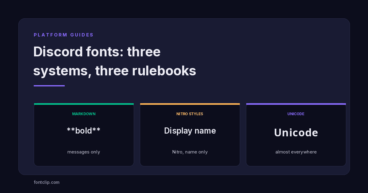 Platform Guides
Discord Fonts: Three Systems and Which Fields They Reach
Markdown, Nitro styles and Unicode reach different fields. Which works where, and which styles render as boxes for everyone else.
Read article →Put It Into Practice
285 named, tested styles — with an honest note wherever one has limits.
Open the generator →